pacman::p_load(tidyverse, plotly, crosstalk, DT, ggdist, gganimate)Hands-on Exercise 4: Visualising Uncertainty
Overview
In this hands-on exercise
Visualizing the uncertainty of point estimates
- A point estimate is a single number, such as a mean.
- Uncertainty is expressed as standard error, confidence interval, or credible interval
- Important:
- Don’t confuse the uncertainty of a point estimate with the variation in the sample
exam <- read_csv("data/Exam_data.csv")Visualizing the uncertainty of point estimates: ggplot2 methods
The code chunk below performs the followings:
- group the observation by RACE,
- computes the count of observations, mean, standard deviation and standard error of Maths by RACE, and
- save the output as a tibble data table called
my_sum.
my_sum <- exam %>%
  group_by(RACE) %>%
  summarise(
    n=n(),
    mean=mean(MATHS),
    sd=sd(MATHS)
    ) %>%
  mutate(se=sd/sqrt(n-1))
Note: For the mathematical explanation, please refer to Slide 20 of Lesson 4.
Next, the code chunk below will
knitr::kable(head(my_sum), format = 'html')| RACE | n | mean | sd | se |
|---|---|---|---|---|
| Chinese | 193 | 76.50777 | 15.69040 | 1.132357 |
| Indian | 12 | 60.66667 | 23.35237 | 7.041005 |
| Malay | 108 | 57.44444 | 21.13478 | 2.043177 |
| Others | 9 | 69.66667 | 10.72381 | 3.791438 |
Visualizing the uncertainty of point estimates: ggplot2 methods
The code chunk below is used to reveal the standard error of mean maths score by race.
ggplot(my_sum) +
  geom_errorbar(
    aes(x=RACE,
        ymin=mean-se,
        ymax=mean+se),
    width=0.2,
    colour="black",
    alpha=0.9,
    size=0.5) +
  geom_point(aes
           (x=RACE,
            y=mean),
           stat="identity",
           color="red",
           size = 1.5,
           alpha=1) +
  ggtitle("Standard error of mean
          maths score by rac")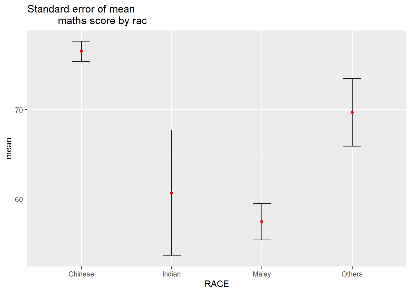
Visualizing the uncertainty of point estimates: ggplot2 methods
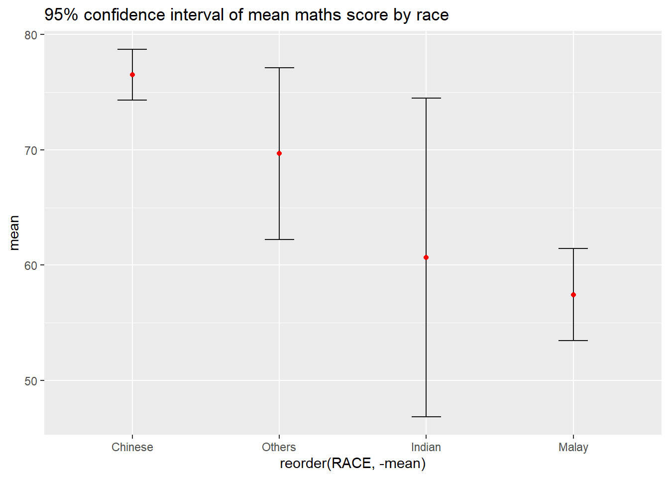
Your turn
Plot the 95% confidence interval of mean maths score by race. The error bars should be sorted by the average maths scores.
Visualizing the uncertainty of point estimates with interactive error bars
Your turn
Plot interactive error bars for the 99% confidence interval of mean maths score by race.
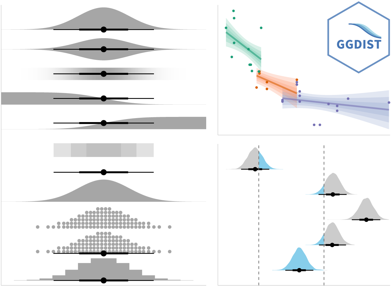
Visualising Uncertainty: ggdist package
- ggdist is an R package that provides a flexible set of ggplot2 geoms and stats designed especially for visualising distributions and uncertainty.
- It is designed for both frequentist and Bayesian uncertainty visualization, taking the view that uncertainty visualization can be unified through the perspective of distribution visualization:
- for frequentist models, one visualises confidence distributions or bootstrap distributions (see vignette(“freq-uncertainty-vis”));
- for Bayesian models, one visualises probability distributions (see the tidybayes package, which builds on top of ggdist).
Visualizing the uncertainty of point estimates: ggdist methods
In the code chunk below, stat_pointinterval() of ggdist is used to build a visual for displaying distribution of maths scores by race.
exam %>%
  ggplot(aes(x = RACE,
             y = MATHS)) +
  stat_pointinterval() +   #<<
  labs(
    title = "Visualising confidence intervals of mean math score",
    subtitle = "Mean Point + Multiple-interval plot")
Gentle advice: This function comes with many arguments, students are advised to read the syntax reference for more detail.
exam %>%
  ggplot(aes(x = RACE, y = MATHS)) +
  stat_pointinterval(.width = 0.95,
  .point = median,
  .interval = qi) +
  labs(
    title = "Visualising confidence intervals of mean math score",
    subtitle = "Mean Point + Multiple-interval plot")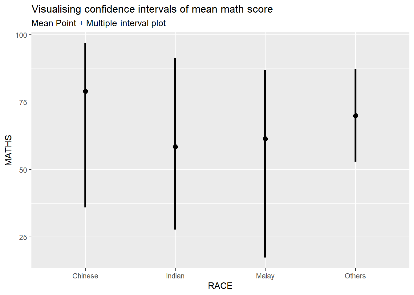
Visualizing the uncertainty of point estimates: ggdist methods
Your turn
Makeover the plot on previous slide by showing 95% and 99% confidence intervals.
exam %>%
  ggplot(aes(x = RACE,
             y = MATHS)) +
  stat_pointinterval(
    show.legend = FALSE) +
  labs(
    title = "Visualising confidence intervals of mean math score",
    subtitle = "Mean Point + Multiple-interval plot")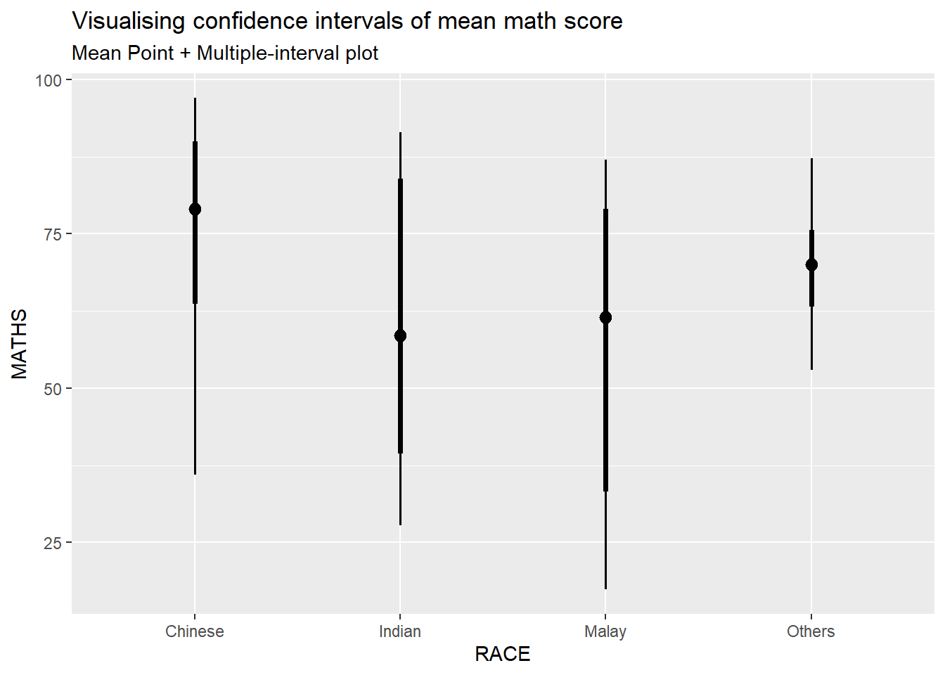
Gentle advice: This function comes with many arguments, students are advised to read the syntax reference for more detail.
Visualizing the uncertainty of point estimates: ggdist methods
In the code chunk below, stat_gradientinterval() of ggdist is used to build a visual for displaying distribution of maths scores by race.
exam %>%
  ggplot(aes(x = RACE,
             y = MATHS)) +
  stat_gradientinterval(
    fill = "skyblue",
    show.legend = TRUE
  ) +
  labs(
    title = "Visualising confidence intervals of mean math score",
    subtitle = "Gradient + interval plot")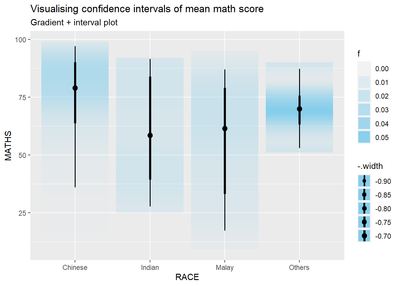
Gentle advice: This function comes with many arguments, students are advised to read the syntax reference for more detail.
Visualising Uncertainty with Hypothetical Outcome Plots (HOPs)
Step 1: Installing ungeviz package
devtools::install_github("wilkelab/ungeviz")Note: You only need to perform this step once.
Step 2: Launch the application in R
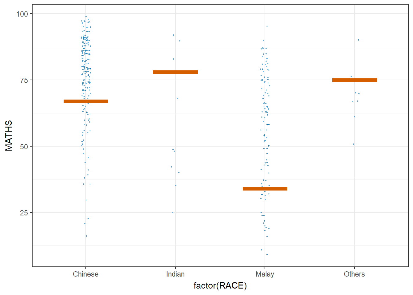
library(ungeviz)ggplot(data = exam,
(aes(x = factor(RACE), y = MATHS))) +
geom_point(position = position_jitter(
height = 0.3, width = 0.05),
size = 0.4, color = "#0072B2", alpha = 1/2) +
geom_hpline(data = sampler(25, group = RACE), height = 0.6, color = "#D55E00") +
theme_bw() +
# `.draw` is a generated column indicating the sample draw
transition_states(.draw, 1, 3)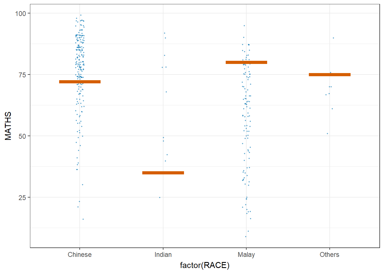
Visualising Uncertainty with Hypothetical Outcome Plots (HOPs)
ggplot(data = exam,
       (aes(x = factor(RACE),
            y = MATHS))) +
  geom_point(position = position_jitter(
    height = 0.3,
    width = 0.05),
    size = 0.4,
    color = "#0072B2",
    alpha = 1/2) +
  geom_hpline(data = sampler(25,
                             group = RACE),
              height = 0.6,
              color = "#D55E00") +
  theme_bw() +
  transition_states(.draw, 1, 3)