Hands-on Exercise 3: Programming Interactive Data Visualisation with R
Interactive Data Visualisation with R
In this hands-on exercise, you will learn how to create:
interactive data visualisation by using ggiraph and plotlyr packages,
animated data visualisation by using gganimate and plotlyr packages.
Visualising univariate data with large number of categories by using rPackedBar package.
At the same time, you will also learn how to:
reshape data by using tidyr package, and
process, wrangle and transform data by using dplyr package.
Getting Started
First, write a code chunk to check, install and launch the following R packages:
- ggiraph for making ‘ggplot’ graphics interactive.
- plotly, R library for plotting interactive statistical graphs.
- gganimate, an ggplot extension for creating animated statistical graphs.
- DT provides an R interface to the JavaScript library DataTables that create interactive table on html page.
- tidyverse, a family of modern R packages specially designed to support data science, analysis and communication task including creating static statistical graphs.
- patchwork for compising multiple plots.
The solution:
Importing Data
In this section, Exam_data.csv provided will be used. Using read_csv() of readr package, import Exam_data.csv into R.
The solution:
Rows: 322 Columns: 7
── Column specification ────────────────────────────────────────────────────────
Delimiter: ","
chr (4): ID, CLASS, GENDER, RACE
dbl (3): ENGLISH, MATHS, SCIENCE

ℹ Use `spec()` to retrieve the full column specification for this data.
ℹ Specify the column types or set `show_col_types = FALSE` to quiet this message.
Interactive Data Visualisation - ggiraph methods
ggiraph is an htmlwidget and a ggplot2 extension. It allows ggplot graphics to be interactive.
Interactive is made with ggplot geometries that can understand three arguments:
- Tooltip: a column of data-sets that contain tooltips to be displayed when the mouse is over elements.
- Onclick: a column of data-sets that contain a JavaScript function to be executed when elements are clicked.
- Data_id: a column of data-sets that contain an id to be associated with elements.
If it used within a shiny application, elements associated with an id (data_id) can be selected and manipulated on client and server sides. Refer to this article for more detail explanation.
Tooltip effect with tooltip aesthetic
Below shows a typical code chunk to plot an interactive statistical graph by using ggiraph package. Notice that the code chunk consists of two parts. First, an ggplot object will be created. Next, girafe() of ggiraph will be used to create an interactive svg object.
p <- ggplot(data=exam_data,
       aes(x = MATHS)) +
  geom_dotplot_interactive(
    aes(tooltip = ID),
    stackgroups = TRUE,
    binwidth = 1,
    method = "histodot") +
  scale_y_continuous(NULL,
                     breaks = NULL)
girafe(
  ggobj = p,
  width_svg = 6,
  height_svg = 6*0.618
)
Interactivity: By hovering the mouse pointer on an data point of interest, the student’s ID will be displayed.
Comparing ggplot2 and ggiraph codes
The original ggplot2 code chunk.
ggplot(data=exam_data,
       aes(x = MATHS)) +
  geom_dotplot(binwidth=2.5,
               dotsize = 0.5) +
  scale_y_continuous(NULL,
                     breaks = NULL)
The ggiraph code chunk.
p <- ggplot(data=exam_data,
       aes(x = MATHS)) +
  geom_dotplot_interactive(              #<<
    aes(tooltip = ID),                   #<<
    stackgroups = TRUE,                  #<<
    binwidth = 1,                        #<<
    method = "histodot") +               #<<
  scale_y_continuous(NULL,
                     breaks = NULL)
girafe(                                  #<<
  ggobj = p,                             #<<
  width_svg = 6,                         #<<
  height_svg = 6*0.618                   #<<
)                                        #<<
Notice that two steps are involved. First, an interactive version of ggplot2 geom (i.e. geom_dotplot_interactive()) will be used to create the basic graph. Then, girafe() will be used to generate an svg object to be displayed on an html page.
Displaying multiple information on tooltip
The content of the tooltip can be customised by including a list object as shown in the code chunk below.
exam_data$tooltip <- c(paste0(     #<<
  "Name = ", exam_data$ID,         #<<
  "\n Class = ", exam_data$CLASS)) #<<

p <- ggplot(data=exam_data,
       aes(x = MATHS)) +
  geom_dotplot_interactive(
    aes(tooltip = exam_data$tooltip), #<<
    stackgroups = TRUE,
    binwidth = 1,
    method = "histodot") +
  scale_y_continuous(NULL,
                     breaks = NULL)
girafe(
  ggobj = p,
  width_svg = 8,
  height_svg = 8*0.618
)
Interactivity: By hovering the mouse pointer on an data point of interest, the student’s ID and Class will be displayed.
The first three lines of codes in the code chunk create a new field called tooltip. At the same time, it populates text in ID and CLASS fields into the newly created field. Next, this newly created field is used as tooltip field as shown in the code of line 7.
Customising Tooltip style
Code chunk below uses opts_tooltip() of ggiraph to customize tooltip rendering by add css declarations.
tooltip_css <- "background-color:white; #<<
font-style:bold; color:black;" #<<

p <- ggplot(data=exam_data,
       aes(x = MATHS)) +
  geom_dotplot_interactive(
    aes(tooltip = ID),
    stackgroups = TRUE,
    binwidth = 1,
    method = "histodot") +
  scale_y_continuous(NULL,
                     breaks = NULL)
girafe(
  ggobj = p,
  width_svg = 6,
  height_svg = 6*0.618,
  options = list(    #<<
    opts_tooltip(    #<<
      css = tooltip_css)) #<<
)
Notice that the background colour of the tooltip is black and the font colour is white and bold.
- Refer to Customizing girafe objects to learn more about how to customise ggiraph objects.
Displaying statistics on tooltip
tooltip <- function(y, ymax, accuracy = .01) {   #<<
  mean <- scales::number(y, accuracy = accuracy) #<<
  sem <- scales::number(ymax - y, accuracy = accuracy) #<<
  paste("Mean maths scores:", mean, "+/-", sem) #<<
} #<<

gg_point <- ggplot(data=exam_data,
                   aes(x = RACE),
) +
  stat_summary(aes(y = MATHS,
                   tooltip = after_stat(  #<<
                     tooltip(y, ymax))),  #<<
    fun.data = "mean_se",
    geom = GeomInteractiveCol,  #<<
    fill = "light blue"
  ) +
  stat_summary(aes(y = MATHS),
    fun.data = mean_se,
    geom = "errorbar", width = 0.2, size = 0.2
  )

girafe(ggobj = gg_point,
       width_svg = 8,
       height_svg = 8*0.618)
Code chunk on the left shows an advanced way to customise tooltip. In this example, a function is used to compute 90% confident interval of the mean. The derived statistics are then displayed in the tooltip.
Warning: Using `size` aesthetic for lines was deprecated in ggplot2 3.4.0.
ℹ Please use `linewidth` instead.
Hover effect with data_id aesthetic
Code chunk below show the second interactive feature of ggiraph, namely data_id.
p <- ggplot(data=exam_data,
       aes(x = MATHS)) +
  geom_dotplot_interactive(
    aes(data_id = CLASS),             #<<
    stackgroups = TRUE,
    binwidth = 1,
    method = "histodot") +
  scale_y_continuous(NULL,
                     breaks = NULL)
girafe(
  ggobj = p,
  width_svg = 6,
  height_svg = 6*0.618
)
Interactivity: Elements associated with a data_id (i.e CLASS) will be highlighted upon mouse over.
Note that the default value of the hover css is hover_css = “fill:orange;”.
Styling hover effect
In the code chunk below, css codes are used to change the highlighting effect.
p <- ggplot(data=exam_data,
       aes(x = MATHS)) +
  geom_dotplot_interactive(
    aes(data_id = CLASS),
    stackgroups = TRUE,
    binwidth = 1,
    method = "histodot") +
  scale_y_continuous(NULL,
                     breaks = NULL)
girafe(
  ggobj = p,
  width_svg = 6,
  height_svg = 6*0.618,
  options = list(                        #<<
    opts_hover(css = "fill: #202020;"),  #<<
    opts_hover_inv(css = "opacity:0.2;") #<<
  )                                      #<<
)
Interactivity: Elements associated with a data_id (i.e CLASS) will be highlighted upon mouse over.
Note: Different from Slide 9, in this example the ccs customisation request are encoded directly.
Combining tooltip and hover effect
There are time that we want to combine tooltip and hover effect on the interactive statistical graph as shown in the code chunk below.
p <- ggplot(data=exam_data,
       aes(x = MATHS)) +
  geom_dotplot_interactive(
    aes(tooltip = CLASS, #<<
        data_id = CLASS),#<<
    stackgroups = TRUE,
    binwidth = 1,
    method = "histodot") +
  scale_y_continuous(NULL,
                     breaks = NULL)
girafe(
  ggobj = p,
  width_svg = 6,
  height_svg = 6*0.618,
  options = list(
    opts_hover(css = "fill: #202020;"),
    opts_hover_inv(css = "opacity:0.2;")
  )
)
Interactivity: Elements associated with a data_id (i.e CLASS) will be highlighted upon mouse over. At the same time, the tooltip will show the CLASS.
Click effect with onclick
onclick argument of ggiraph provides hotlink interactivity on ther web.
The code chunk below shown an example of onclick.
exam_data$onclick <- sprintf("window.open(\"%s%s\")",
"https://www.moe.gov.sg/schoolfinder?journey=Primary%20school",
as.character(exam_data$ID))

p <- ggplot(data=exam_data,
       aes(x = MATHS)) +
  geom_dotplot_interactive(
    aes(onclick = onclick),              #<<
    stackgroups = TRUE,
    binwidth = 1,
    method = "histodot") +
  scale_y_continuous(NULL,
                     breaks = NULL)
girafe(
  ggobj = p,
  width_svg = 6,
  height_svg = 6*0.618)
Interactivity: Web document link with a data object will be displayed on the web browser upon mouse click.
Note that click actions must be a string column in the dataset containing valid javascript instructions.
Coordinated Multiple Views with ggiraph
Coordinated multiple views methods has been implemented in the data visualisation on the right.
- when a data point of one of the dotplot is selected, the corresponding data point ID on the second data visualisation will be highlighted too.
Coordinated Multiple Views with ggiraph
In order to build a coordinated multiple views, the following programming strategy will be used:
- Appropriate interactive functions of ggiraph will be used to create the multiple views.
- patchwork function of patchwork package will be used inside girafe function to create the interactive coordinated multiple views.
p1 <- ggplot(data=exam_data,
       aes(x = MATHS)) +
  geom_dotplot_interactive(
    aes(data_id = ID),
    stackgroups = TRUE,
    binwidth = 1,
    method = "histodot") +
  coord_cartesian(xlim=c(0,100)) + #<<
  scale_y_continuous(NULL,
                     breaks = NULL)
p2 <- ggplot(data=exam_data,
aes(x = ENGLISH)) +
geom_dotplot_interactive(
aes(data_id = ID),
stackgroups = TRUE,
binwidth = 1,
method = "histodot") +
coord_cartesian(xlim=c(0,100)) + #<<
scale_y_continuous(NULL,
breaks = NULL)
girafe(code = print(p1 / p2), #<<
width_svg = 6,
height_svg = 6,
options = list(
opts_hover(css = "fill: #202020;"),
opts_hover_inv(css = "opacity:0.2;")
)
) The data_id aesthetic is critical to link observations between plots and the tooltip aesthetic is optional but nice to have when mouse over a point.
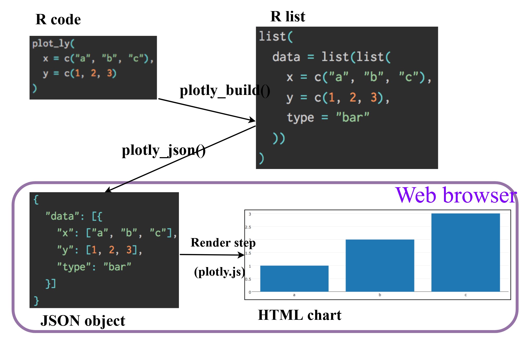
Interactive Data Visualisation - plotly methods!
- Plotly’s R graphing library create interactive web graphics from ggplot2 graphs and/or a custom interface to the (MIT-licensed) JavaScript library plotly.js inspired by the grammar of graphics.
- Different from other plotly platform, plot.R is free and open source.
There are two ways to create interactive graph by using plotly, they are:
- by using plot_ly(), and
- by using ggplotly()
Creating an interactive scatter plot: plot_ly() method
The code chunk below plots an interactive scatter plot by using plot_ly().
plot_ly(data = exam_data,
             x = ~MATHS,
             y = ~ENGLISH)
The output:
No trace type specified:
  Based on info supplied, a 'scatter' trace seems appropriate.
  Read more about this trace type -> https://plotly.com/r/reference/#scatter
No scatter mode specifed:
Setting the mode to markers
Read more about this attribute -> https://plotly.com/r/reference/#scatter-modeWorking with visual variable: plot_ly() method
In the code chunk below, color argument is mapped to a qualitative visual variable (i.e. RACE).
plot_ly(data = exam_data,
        x = ~ENGLISH,
        y = ~MATHS,
        color = ~RACE) #<<
Interactive:
- Click on the colour symbol at the legend.
No trace type specified:
  Based on info supplied, a 'scatter' trace seems appropriate.
  Read more about this trace type -> https://plotly.com/r/reference/#scatter
No scatter mode specifed:
Setting the mode to markers
Read more about this attribute -> https://plotly.com/r/reference/#scatter-modeChanging colour pallete: plot_ly() method
In the code chunk below, colors argument is used to change the default colour palette to ColorBrewel colour palette.
plot_ly(data = exam_data,
        x = ~ENGLISH,
        y = ~MATHS,
        color = ~RACE,
        colors = "Set1") #<<
Interactive:
- Click on the colour symbol at the legend.
No trace type specified:
  Based on info supplied, a 'scatter' trace seems appropriate.
  Read more about this trace type -> https://plotly.com/r/reference/#scatter
No scatter mode specifed:
Setting the mode to markers
Read more about this attribute -> https://plotly.com/r/reference/#scatter-modeCustomising colour scheme: plot_ly() method
In the code chunk below, a customised colour scheme is created. Then, colors argument is used to change the default colour palette to the customised colour scheme.
pal <- c("red", "purple", "blue", "green") #<<

plot_ly(data = exam_data,
        x = ~ENGLISH,
        y = ~MATHS,
        color = ~RACE,
        colors = pal) #<<
Interactive:
- Click on the colour symbol at the legend.
No trace type specified:
  Based on info supplied, a 'scatter' trace seems appropriate.
  Read more about this trace type -> https://plotly.com/r/reference/#scatter
No scatter mode specifed:
Setting the mode to markers
Read more about this attribute -> https://plotly.com/r/reference/#scatter-modeCustomising tooltip: plot_ly() method
In the code chunk below, text argument is used to change the default tooltip.
plot_ly(data = exam_data,
        x = ~ENGLISH,
        y = ~MATHS,
        text = ~paste("Student ID:", ID,     #<<
                      "<br>Class:", CLASS),  #<<
        color = ~RACE,
        colors = "Set1")
Interactive:
- Click on the colour symbol at the legend.
No trace type specified:
  Based on info supplied, a 'scatter' trace seems appropriate.
  Read more about this trace type -> https://plotly.com/r/reference/#scatter
No scatter mode specifed:
Setting the mode to markers
Read more about this attribute -> https://plotly.com/r/reference/#scatter-modeWorking with layout: plot_ly() method
In the code chunk below, layout argument is used to change the default tooltip.
plot_ly(data = exam_data,
        x = ~ENGLISH,
        y = ~MATHS,
        text = ~paste("Student ID:", ID,
                      "<br>Class:", CLASS),
        color = ~RACE,
        colors = "Set1") %>%
  layout(title = 'English Score versus Maths Score ', #<<
         xaxis = list(range = c(0, 100)),             #<<
         yaxis = list(range = c(0, 100)))             #<<
To learn more about layout, visit this link.
Interactive:
- Click on the colour symbol at the legend.
No trace type specified:
  Based on info supplied, a 'scatter' trace seems appropriate.
  Read more about this trace type -> https://plotly.com/r/reference/#scatter
No scatter mode specifed:
Setting the mode to markers
Read more about this attribute -> https://plotly.com/r/reference/#scatter-modeCreating an interactive scatter plot: ggplotly() method
The code chunk below plots an interactive scatter plot by using ggplotly().
p <- ggplot(data=exam_data,
            aes(x = MATHS,
                y = ENGLISH)) +
  geom_point(dotsize = 1) +
  coord_cartesian(xlim=c(0,100),
                  ylim=c(0,100))
ggplotly(p) #<<
Notice that the only extra line you need to include in the code chunk is ggplotly().
Coordinated Multiple Views with plotly
Code chunk below plots two scatterplots and places them next to each other side-by-side by using subplot() of plotly package.
p1 <- ggplot(data=exam_data,
              aes(x = MATHS,
                  y = ENGLISH)) +
  geom_point(size=1) +
  coord_cartesian(xlim=c(0,100),
                  ylim=c(0,100))

p2 <- ggplot(data=exam_data,
            aes(x = MATHS,
                y = SCIENCE)) +
  geom_point(size=1) +
  coord_cartesian(xlim=c(0,100),
                  ylim=c(0,100))
subplot(ggplotly(p1),            #<<
        ggplotly(p2))            #<<
The side-by-side scatterplots.
Notice that these two scatter plots are not linked.
Coordinated Multiple Views with plotly
To create a coordinated scatterplots, highlight_key() of plotly package is used.
d <- highlight_key(exam_data)  #<<
p1 <- ggplot(data=d,
            aes(x = MATHS,
                y = ENGLISH)) +
  geom_point(size=1) +
  coord_cartesian(xlim=c(0,100),
                  ylim=c(0,100))

p2 <- ggplot(data=d,
            aes(x = MATHS,
                y = SCIENCE)) +
  geom_point(size=1) +
  coord_cartesian(xlim=c(0,100),
                  ylim=c(0,100))
subplot(ggplotly(p1),
        ggplotly(p2))
Click on a data point of one of the scatterplot and see how the corresponding point on the other scatterplot is selected.
Thing to learn from the code chunk:
highlight_key()simply creates an object of class crosstalk::SharedData.
- Visit this link to learn more about crosstalk,
Interactive Data Visualisation - crosstalk methods!
Crosstalk is an add-on to the htmlwidgets package. It extends htmlwidgets with a set of classes, functions, and conventions for implementing cross-widget interactions (currently, linked brushing and filtering).
Interactive Data Table: DT package
A wrapper of the JavaScript Library DataTables
Data objects in R can be rendered as HTML tables using the JavaScript library ‘DataTables’ (typically via R Markdown or Shiny).
DT::datatable(exam_data, class= "compact")Linked brushing: crosstalk method
Setting the `off` event (i.e., 'plotly_deselect') to match the `on` event (i.e., 'plotly_selected'). You can change this default via the `highlight()` function.Code chunk below is used to implement the coordinated brushing shown above.
d <- highlight_key(exam_data)
p <- ggplot(d,
            aes(ENGLISH,
                MATHS)) +
  geom_point(size=1) +
  coord_cartesian(xlim=c(0,100),
                  ylim=c(0,100))

gg <- highlight(ggplotly(p),
                "plotly_selected")

crosstalk::bscols(gg,
                  DT::datatable(d),
                  widths = 5)
Things to learn from the code chunk:
highlight() is a function of plotly package. It sets a variety of options for brushing (i.e., highlighting) multiple plots. These options are primarily designed for linking multiple plotly graphs, and may not behave as expected when linking plotly to another htmlwidget package via crosstalk. In some cases, other htmlwidgets will respect these options, such as persistent selection in leaflet.
bscols() is a helper function of crosstalk package. It makes it easy to put HTML elements side by side. It can be called directly from the console but is especially designed to work in an R Markdown document. Warning: This will bring in all of Bootstrap!.
Animated Data Visualisation: gganimate methods
gganimate extends the grammar of graphics as implemented by ggplot2 to include the description of animation. It does this by providing a range of new grammar classes that can be added to the plot object in order to customise how it should change with time.
transition_*()defines how the data should be spread out and how it relates to itself across time.view_*()defines how the positional scales should change along the animation.shadow_*()defines how data from other points in time should be presented in the given point in time.enter_*()/exit_*()defines how new data should appear and how old data should disappear during the course of the animation.ease_aes()defines how different aesthetics should be eased during transitions.
Getting started
Add the following packages in the packages list:
- gganimate: An ggplot extension for creating animated statistical graphs.
- gifski converts video frames to GIF animations using pngquant’s fancy features for efficient cross-frame palettes and temporal dithering. It produces animated GIFs that use thousands of colors per frame.
- gapminder: An excerpt of the data available at Gapminder.org. We just want to use its country_colors scheme.
Importing the data
In this hands-on exercise, the Data worksheet from GlobalPopulation Excel workbook will be used.
Write a code chunk to import Data worksheet from GlobalPopulation Excel workbook by using appropriate R package from tidyverse family.
col <- c("Country", "Continent")
globalPop <- read_xls("data/GlobalPopulation.xls",
                      sheet="Data") %>%
  mutate_each_(funs(factor(.)), col) %>%
  mutate(Year = as.integer(Year))
Warning: `mutate_each_()` was deprecated in dplyr 0.7.0.
ℹ Please use `across()` instead.Warning: `funs()` was deprecated in dplyr 0.8.0.
ℹ Please use a list of either functions or lambdas:
# Simple named list: list(mean = mean, median = median)
# Auto named with `tibble::lst()`: tibble::lst(mean, median)
# Using lambdas list(~ mean(., trim = .2), ~ median(., na.rm = TRUE)){.pullout-note} Things to learn from the code chunk above:
read_xls()of readxl package is used to import the Excel worksheet.mutate_each_()of dplyr package is used to convert all character data type into factor.mutateof dplyr package is used to convert data values of Year field into integer.
Building a static population bubble plot
In the code chunk below, the basic ggplot2 functions are used to create a static bubble plot.
ggplot(globalPop, aes(x = Old, y = Young,
                      size = Population,
                      colour = Country)) +
  geom_point(alpha = 0.7,
             show.legend = FALSE) +
  scale_colour_manual(values = country_colors) +
  scale_size(range = c(2, 12)) +
  labs(title = 'Year: {frame_time}',
       x = '% Aged',
y = '% Young') 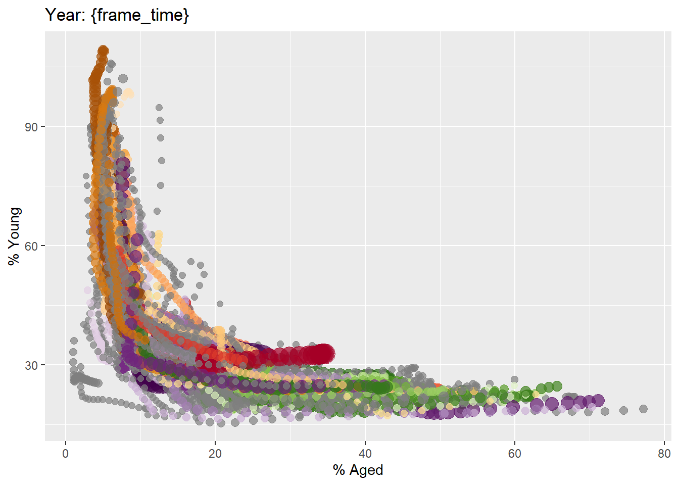
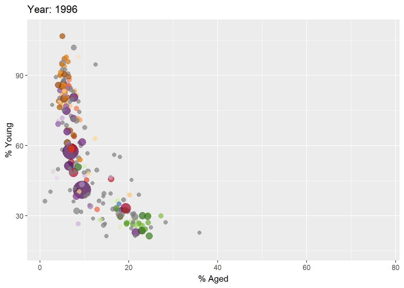
Building the animated bubble plot
In the code chunk below,
transition_time()of gganimate is used to create transition through distinct states in time (i.e. Year).ease_aes()is used to control easing of aesthetics. The default islinear. Other methods are: quadratic, cubic, quartic, quintic, sine, circular, exponential, elastic, back, and bounce.
ggplot(globalPop, aes(x = Old, y = Young,
                      size = Population,
                      colour = Country)) +
  geom_point(alpha = 0.7,
             show.legend = FALSE) +
  scale_colour_manual(values = country_colors) +
  scale_size(range = c(2, 12)) +
  labs(title = 'Year: {frame_time}',
       x = '% Aged',
       y = '% Young') +
  transition_time(Year) +       #<<
  ease_aes('linear')            #<<
The animated bubble chart
Visualising Large Data Interactively
In this hands-on exercise you will learn how to visualise large data by using packed bar methods. For the purpose of this hands-on exercise, two data sets will be used. They are:
GDP.csv provides GDP, GDP per capita and GDP PPP data for world countries from 2000 to 2020. The data was extracted from World Development Indicators Database of World Bank.
WorldCountry.csv provides a list of country names and the continent they belong to extracted from Statistics Times.
Write a code chunk to import both data sets by using
read_csv()of readr package.
The solution:
GDP <- read_csv("data/GDP.csv")Rows: 648 Columns: 25
── Column specification ────────────────────────────────────────────────────────
Delimiter: ","
chr (25): Country Name, Country Code, Series Name, Series Code, 2000, 2001, ...
ℹ Use `spec()` to retrieve the full column specification for this data.
ℹ Specify the column types or set `show_col_types = FALSE` to quiet this message.WorldCountry <- read_csv("data/WorldCountry.csv")Rows: 250 Columns: 7
── Column specification ────────────────────────────────────────────────────────
Delimiter: ","
chr (5): Country or Area, ISO-alpha3 Code, Region 1, Region 2, Continent
dbl (2): No, M49 Code
ℹ Use `spec()` to retrieve the full column specification for this data.
ℹ Specify the column types or set `show_col_types = FALSE` to quiet this message.Note: It is always a good practice to check the data structure and examine data values in RStudio.
Data preparetion
Before programming the data visualisation, it is important for us to reshape, wrangle and transform the raw data to meet the data visualisation need.
Code chunk below performs following tasks:
mutate()of dplyr package is used to convert all values in the 202 field into numeric data type.select()of dplyr package is used to extract column 1 to 3 and Values field.pivot_wider()of tidyr package is used to split the values in Series Name field into columns.left_join()of dplyr package is used to perform a left-join by using Country Code of GDP_selected and ISO-alpha3 Code of WorldCountry tibble data tables as unique identifier.
GDP_selected <- GDP %>%
  mutate(Values = as.numeric(`2020`)) %>%
  select(1:3, Values) %>%
  pivot_wider(names_from = `Series Name`,
              values_from = `Values`) %>%
  left_join(y=WorldCountry, by = c("Country Code" = "ISO-alpha3 Code"))
Warning: There was 1 warning in `mutate()`.
ℹ In argument: `Values = as.numeric(`2020`)`.
Caused by warning:
! NAs introduced by coercionIntroducing packed bar method
- packed bar is a relatively new data visualisation method introduced by Xan Gregg from JMP.
- It aims to support the need of visualising skewed data over hundreds of categories.
- The idea is to support the Focus+Context data visualization principle.
- Visit this JMP Blog to learn more about the design principles of packed bar.
Data Preparation
As usual, we need to prepare the data before building the packed bar. Prepare the data by using the code chunk below.
GDP_selected <- GDP %>%
  mutate(GDP = as.numeric(`2020`)) %>%
  filter(`Series Name` == "GDP (current US$)") %>%
  select(1:2, GDP) %>%
  na.omit()
Warning: There was 1 warning in `mutate()`.
ℹ In argument: `GDP = as.numeric(`2020`)`.
Caused by warning:
! NAs introduced by coercionThing to learn from the code chunk above
na.omit()is used to exclude rows with missing values. This is because rPackedBar package does not support missing values.
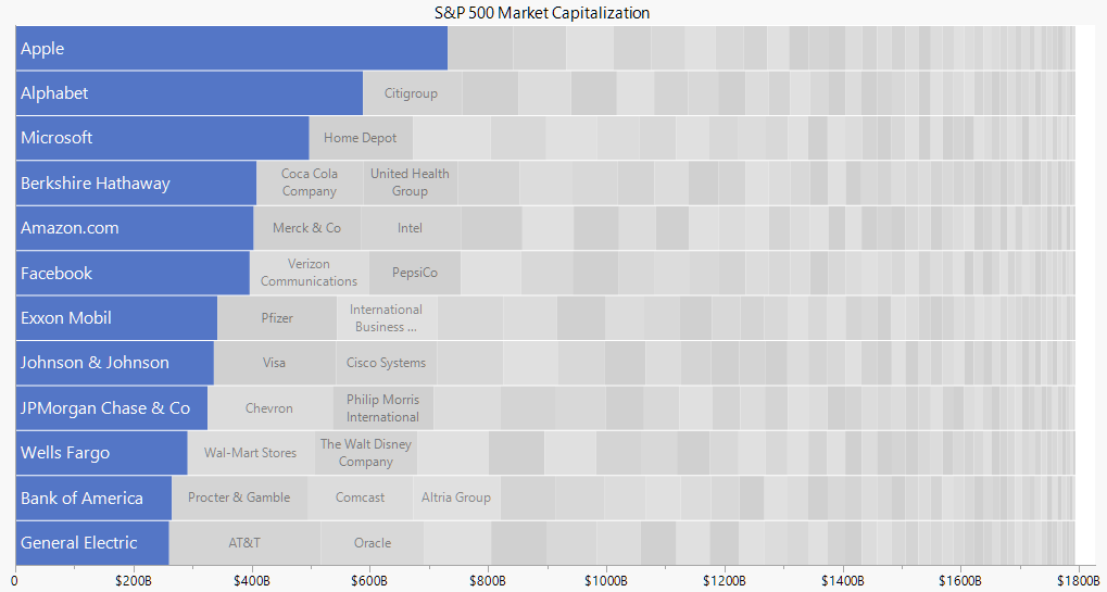
Building a packed bar by using rPackedBar package.
In the code chunk below, plotly_packed_bar() of rPackedBar package is used to create an interactive packed bar.
p = plotly_packed_bar(
  input_data = GDP_selected,
  label_column = "Country Name",
  value_column = "GDP",
  number_rows = 10,
  plot_title = "Top 10 countries by GDP, 2020",
  xaxis_label = "GDP (US$)",
  hover_label = "GDP",
  min_label_width = 0.018,
  color_bar_color = "#00aced",
  label_color = "white")
plotly::config(p, displayModeBar = FALSE)- Read this Vignettes and the user guide to learn more about the package.
The output packed bar:
Warning: `line.width` does not currently support multiple values.

Warning: `line.width` does not currently support multiple values.
Reference
ggiraph
This link provides online version of the reference guide and several useful articles. Use this link to download the pdf version of the reference guide.
- How to Plot With Ggiraph
- Interactive map of France with ggiraph
- Custom interactive sunbursts with ggplot in R
- This link provides code example on how ggiraph is used to interactive graphs for Swiss Olympians - the solo specialists.
plotly for R
- Getting Started with Plotly in R
- A collection of plotly R graphs are available via this link.
- Carson Sievert (2020) Interactive web-based data visualization with R, plotly, and shiny, Chapman and Hall/CRC is the best resource to learn plotly for R. The online version is available via this link
- Plotly R Figure Reference provides a comprehensive discussion of each visual representations.
- Plotly R Library Fundamentals is a good place to learn the fundamental features of Plotly’s R API.
- Getting Started
- Visit this link for a very interesting implementation of gganimate by your senior.
- Building an animation step-by-step with gganimate.
- Creating a composite gif with multiple gganimate panels
Packed Bar
rPackedBar: Packed Bar Charts with ‘plotly’