Content
Beyond ggplot2 Themes
Beyond ggplot2 Annotation
Beyond ggplot2 facet
16 Feb 2023
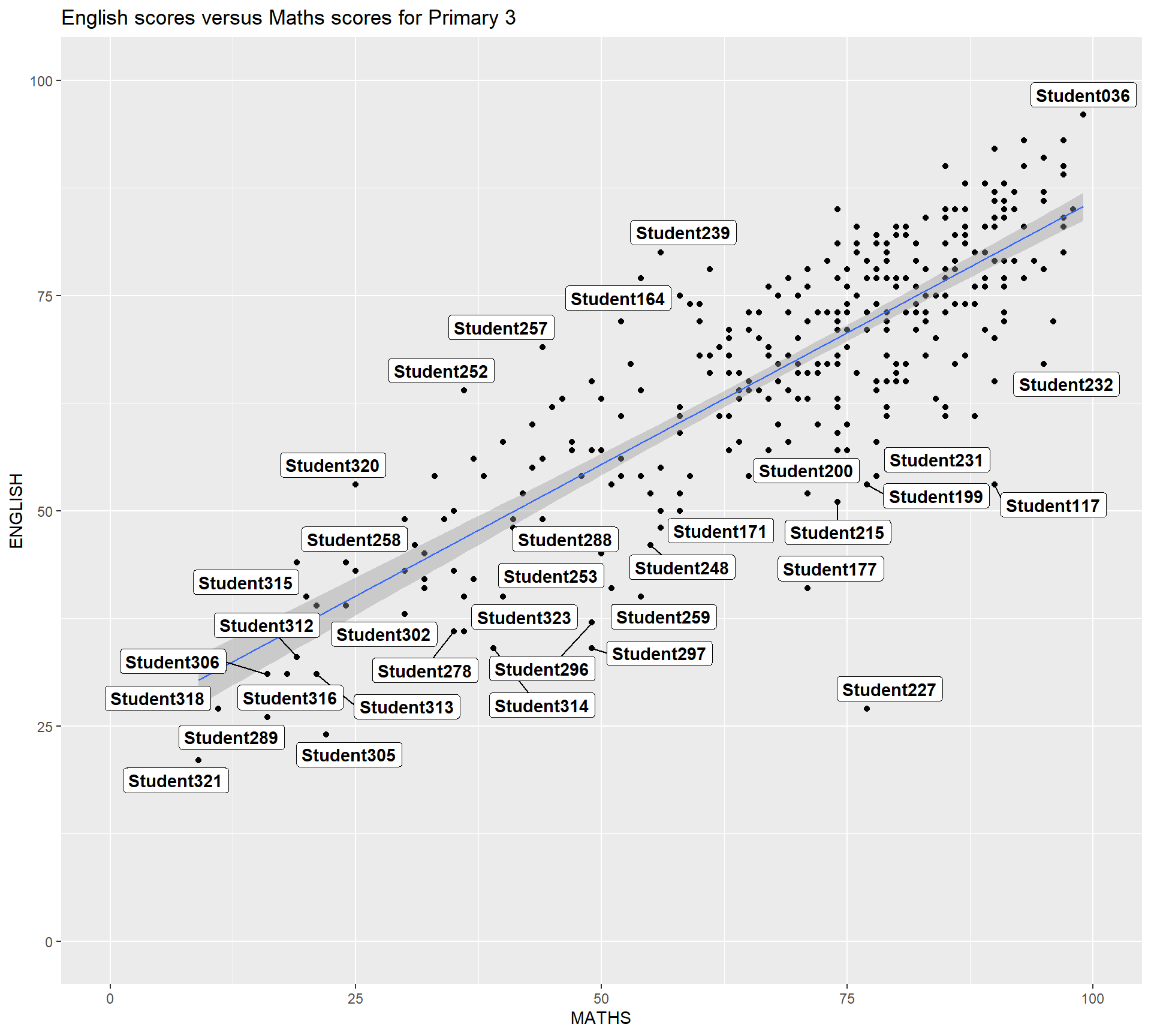
One of the challenge in plotting statistical graph is annotation, especially with large number of data points.
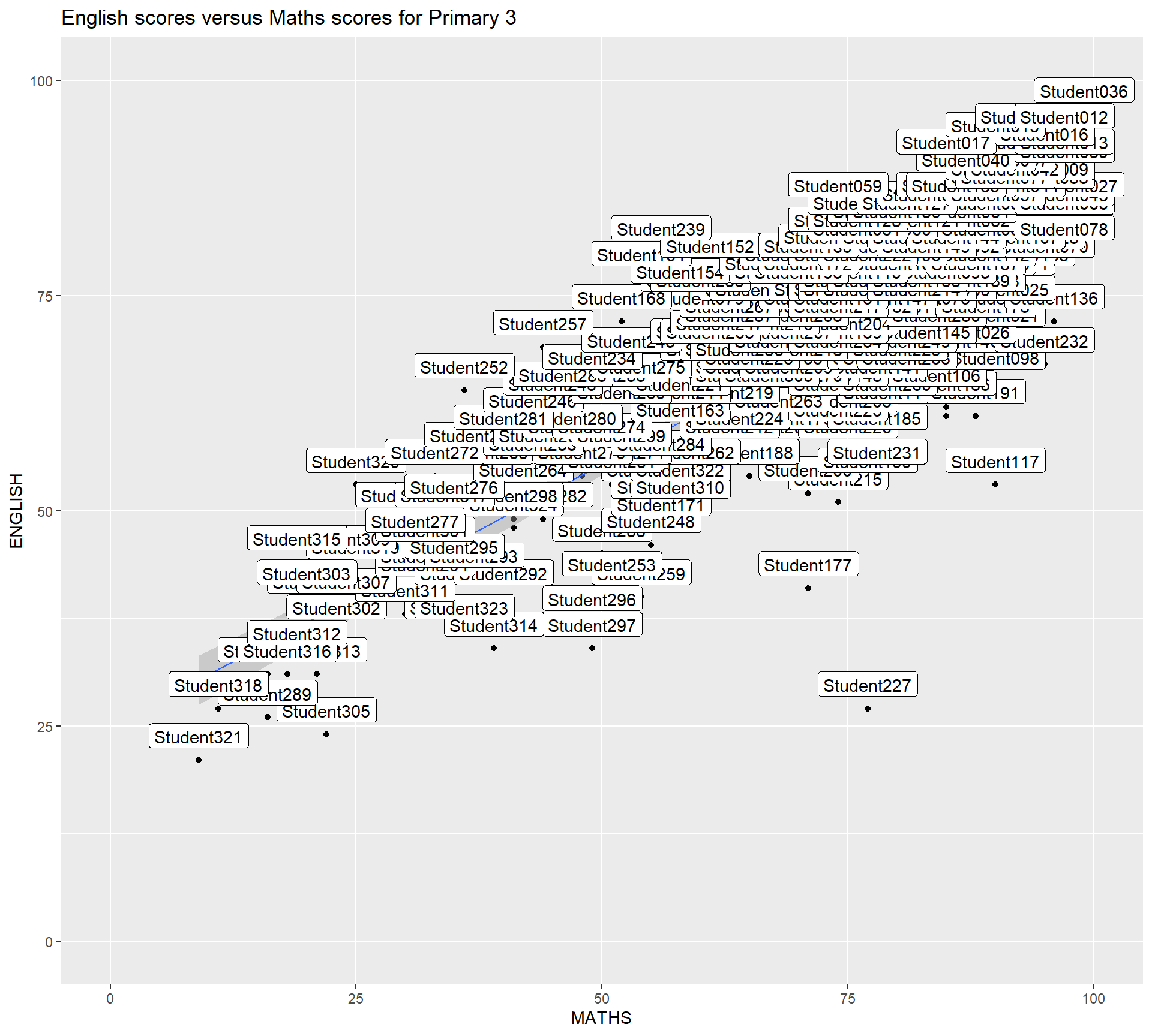
ggrepel is an extension of ggplot2 package which provides geoms for ggplot2 to repel overlapping text as in our examples on the right. We simply replace geom_text() by geom_text_repel() and geom_label() by geom_label_repel.
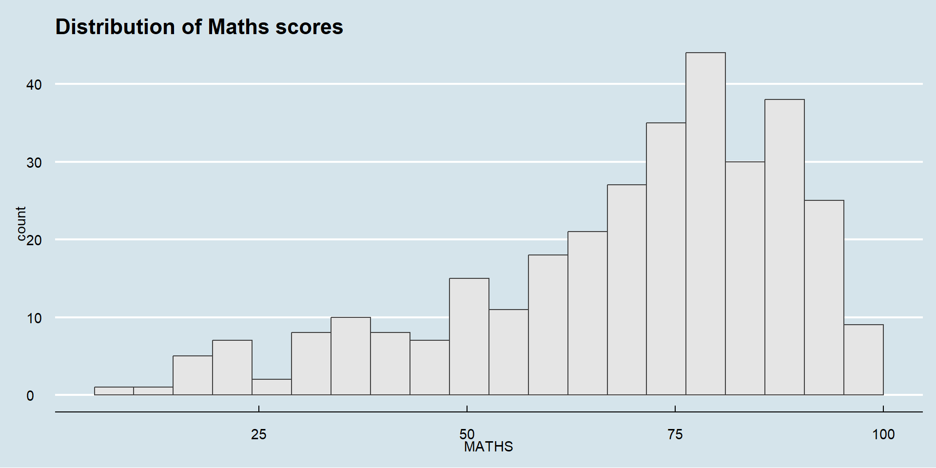
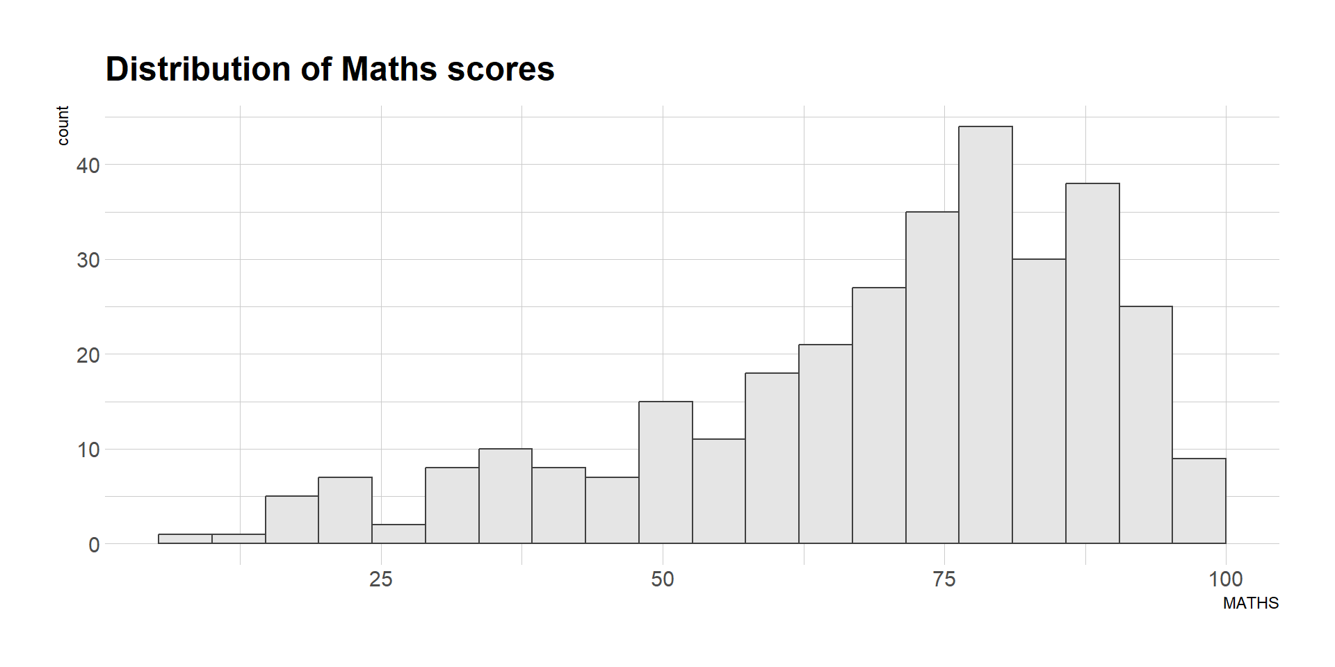
ggplot2 comes with eight built-in themes, they are: theme_gray(), theme_bw(), theme_classic(), theme_dark(), theme_light(), theme_linedraw(), theme_minimal(), and theme_void().
Refer to this link to learn more about ggplot2 Themes
ggthemes provides ‘ggplot2’ themes that replicate the look of plots by Edward Tufte, Stephen Few, Fivethirtyeight, The Economist, ‘Stata’, ‘Excel’, and The Wall Street Journal, among others.
hrbrthemes package provides a base theme that focuses on typographic elements, including where various labels are placed as well as the fonts that are used.
What can we learn from the code chunk below?
axis_title_size argument is used to increase the font size of the axis title to 18,base_size argument is used to increase the default axis label to 15, andgrid argument is used to remove the x-axis grid lines.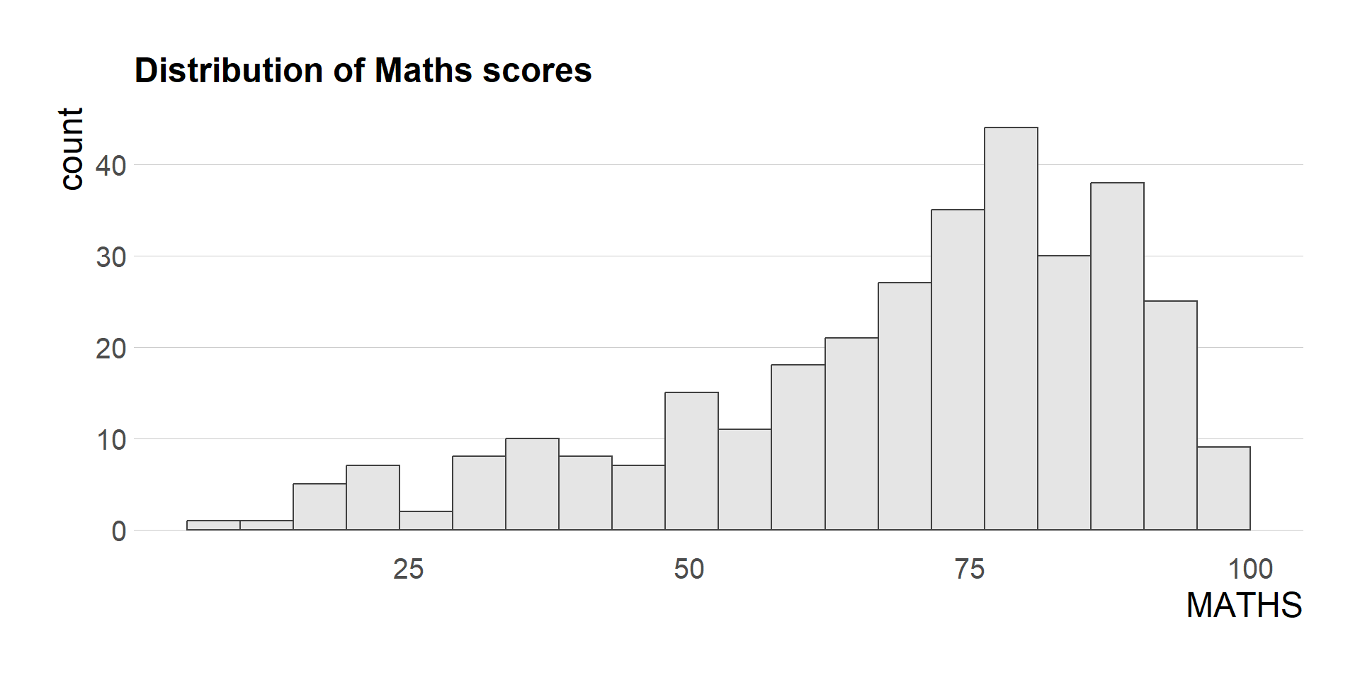
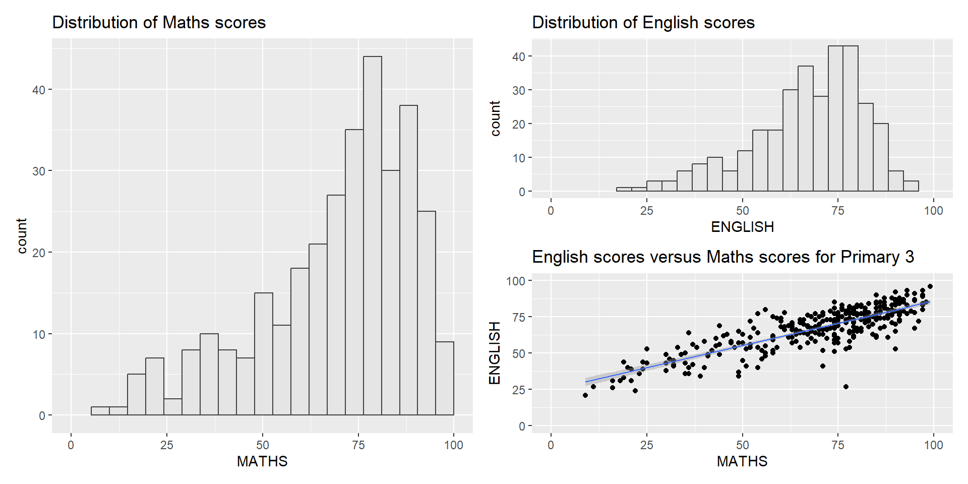
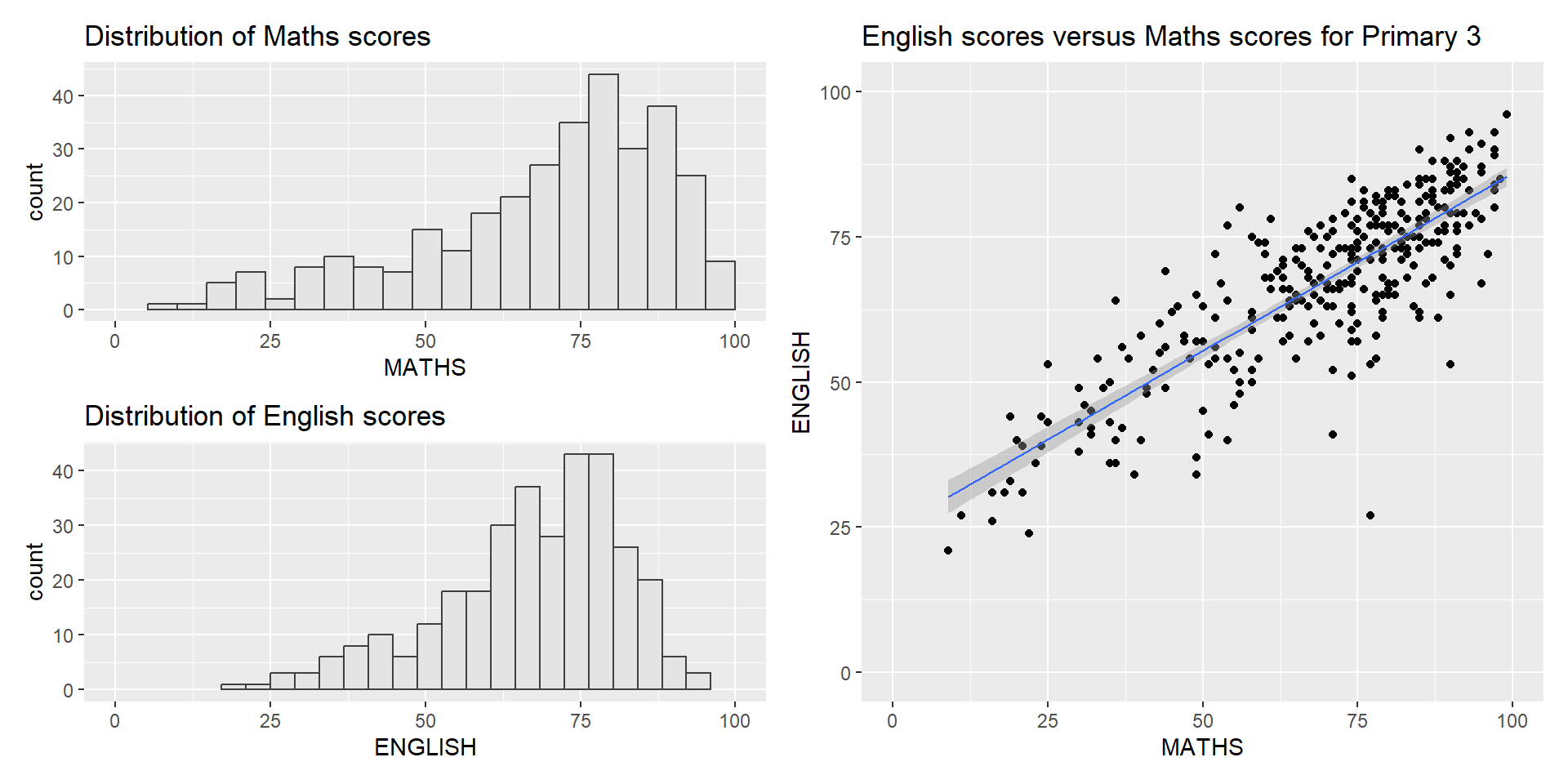
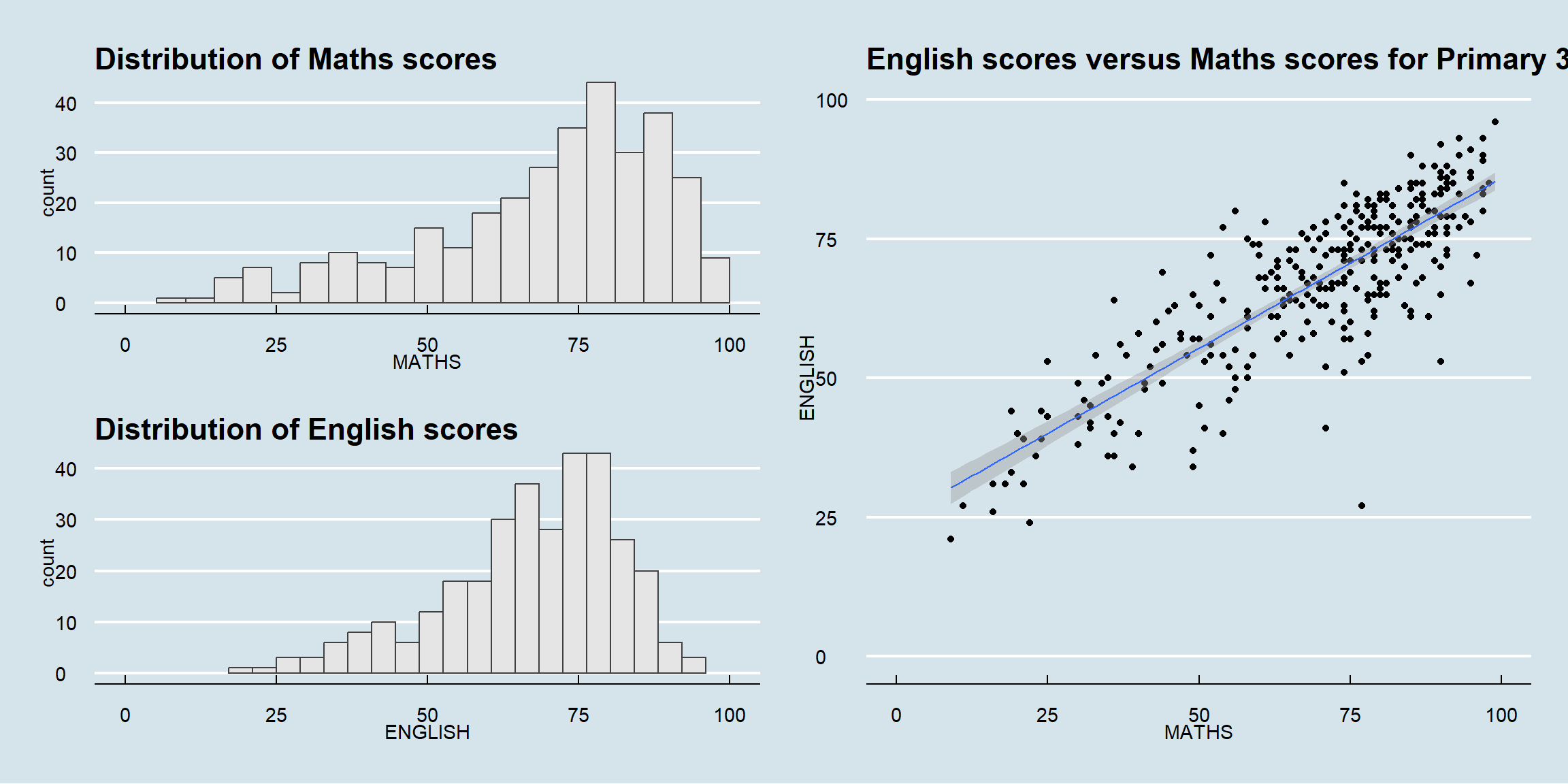
It is not unusual that multiple graphs are required to tell a compelling visual story. There are several ggplot2 extensions provide functions to compose figure with multiple graphs. In this section, I am going to shared with you patchwork.
Patchwork package has a very simple syntax where we can create layouts super easily. Here’s the general syntax that combines: - Two-Column Layout using the Plus Sign +. - Parenthesis () to create a subplot group. - Two-Row Layout using the Division Sign \

| will place the plots beside each other, while / will stack them.
To learn more about, refer to Plot Assembly.
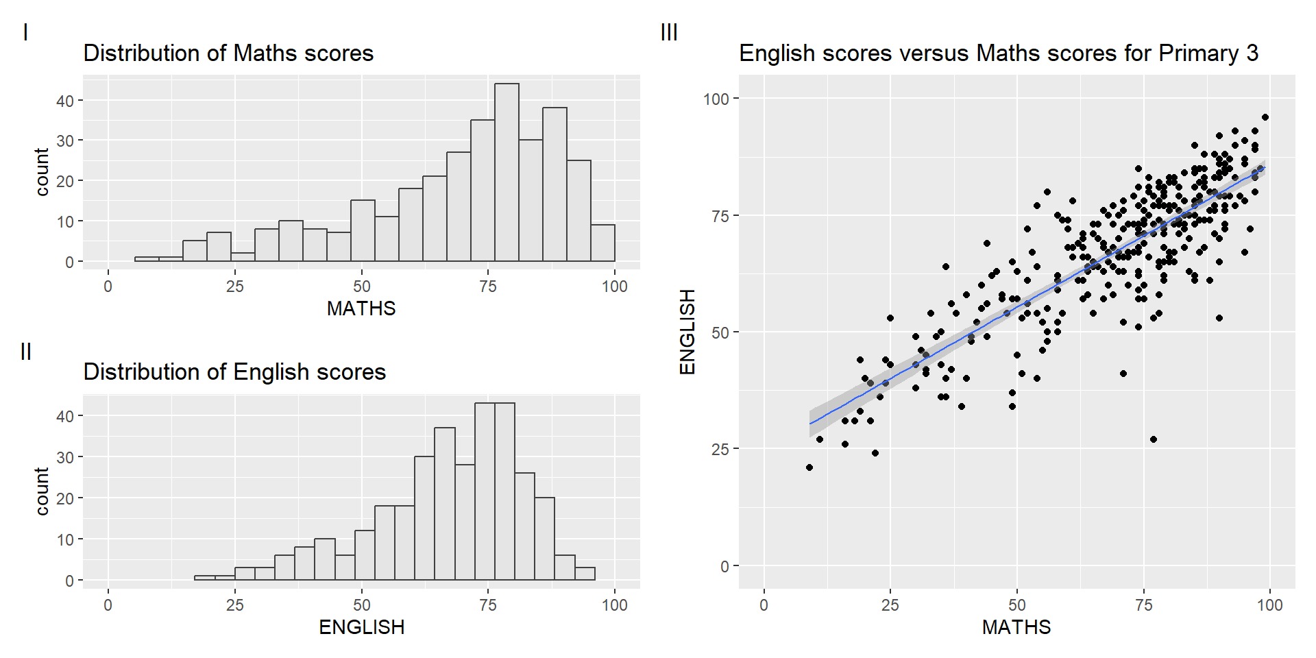
patchwork also provides auto-tagging capabilities, in order to identify subplots in text:
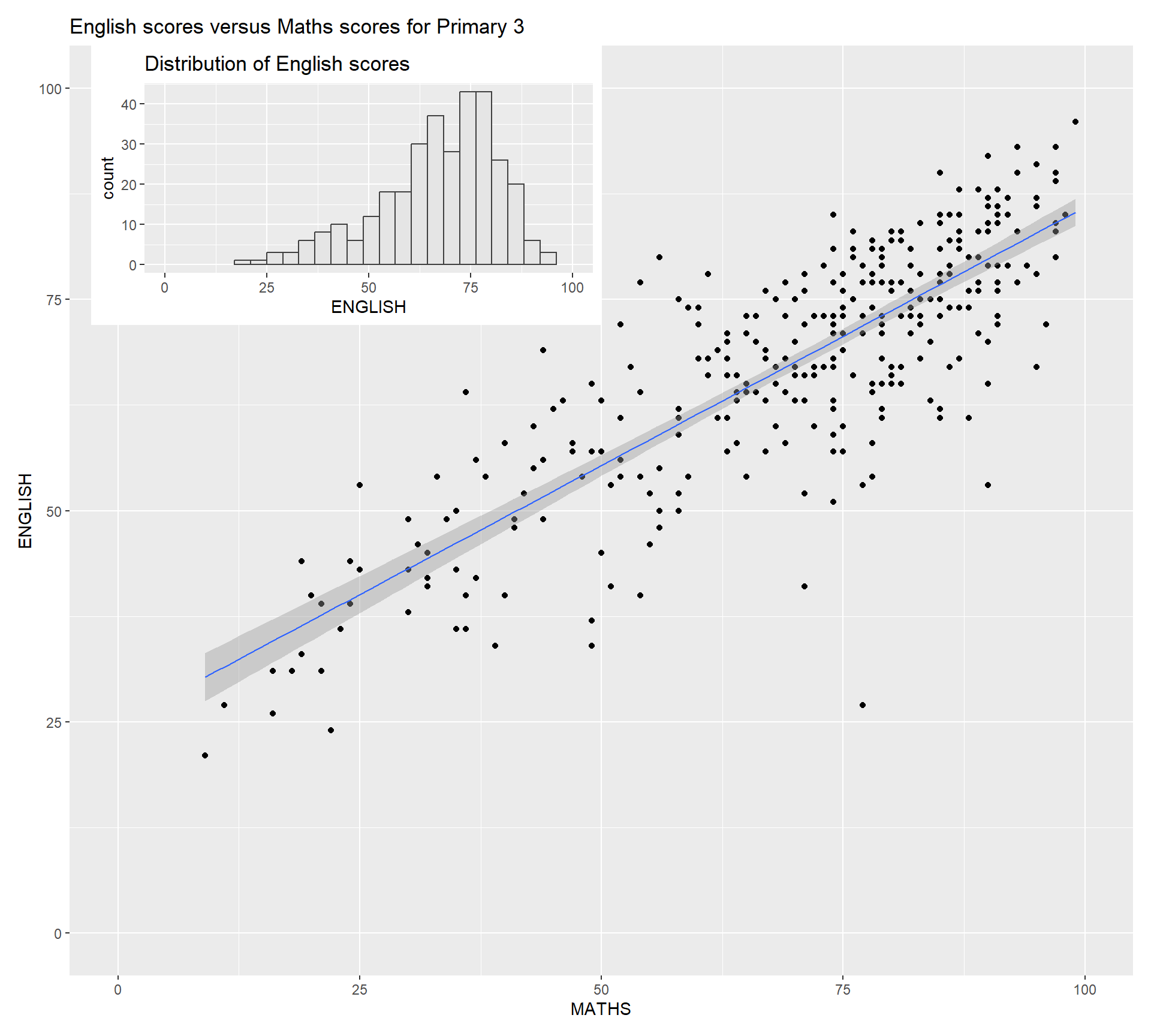
Beside providing functions to place plots next to each other based on the provided layout. With inset_element() of patchwork, we can place one or several plots or graphic elements freely on top or below another plot.