Content
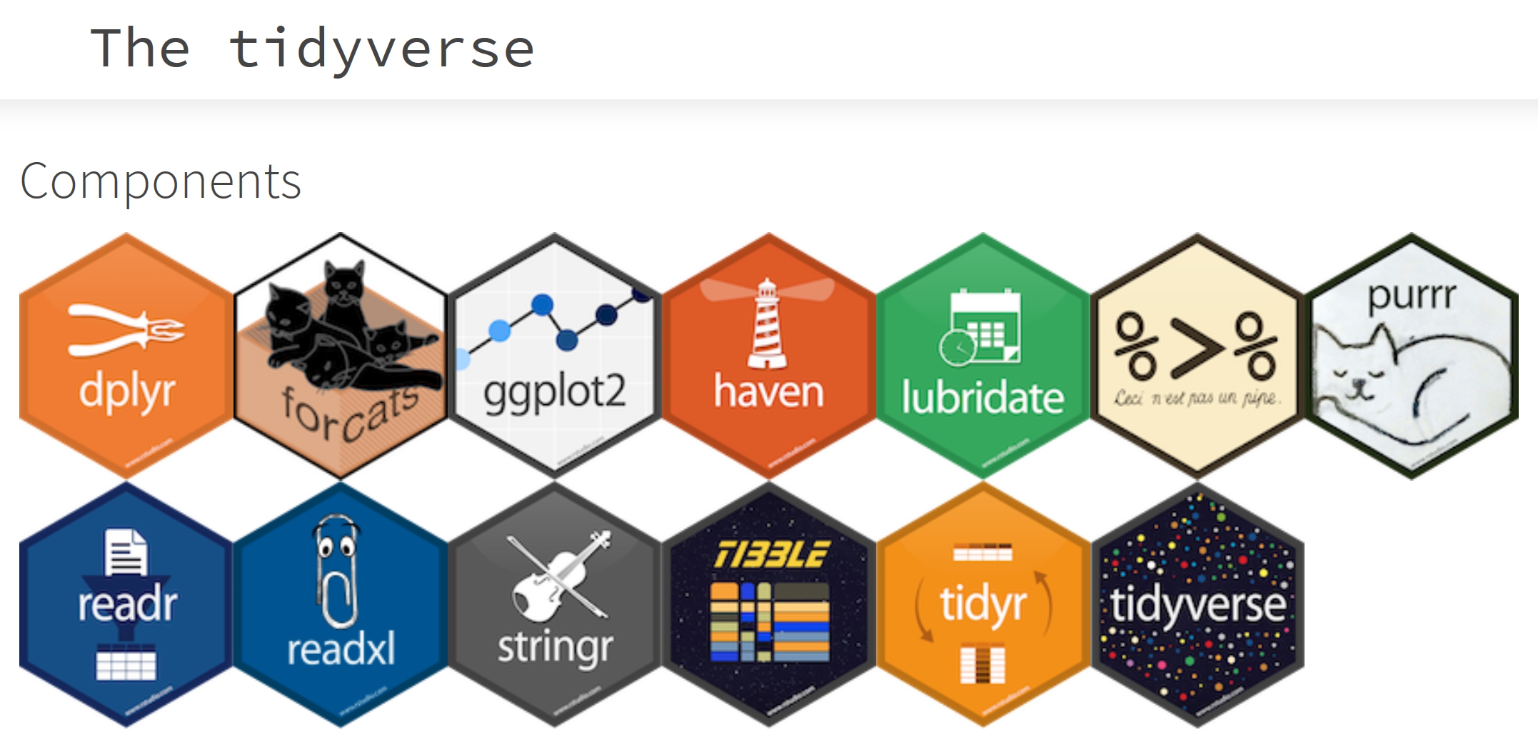
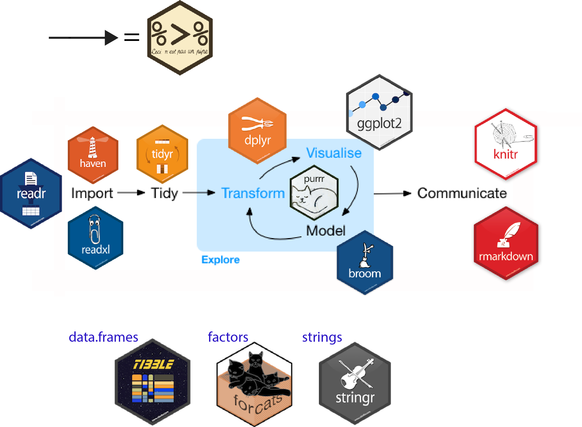
Introducing Tidyverse
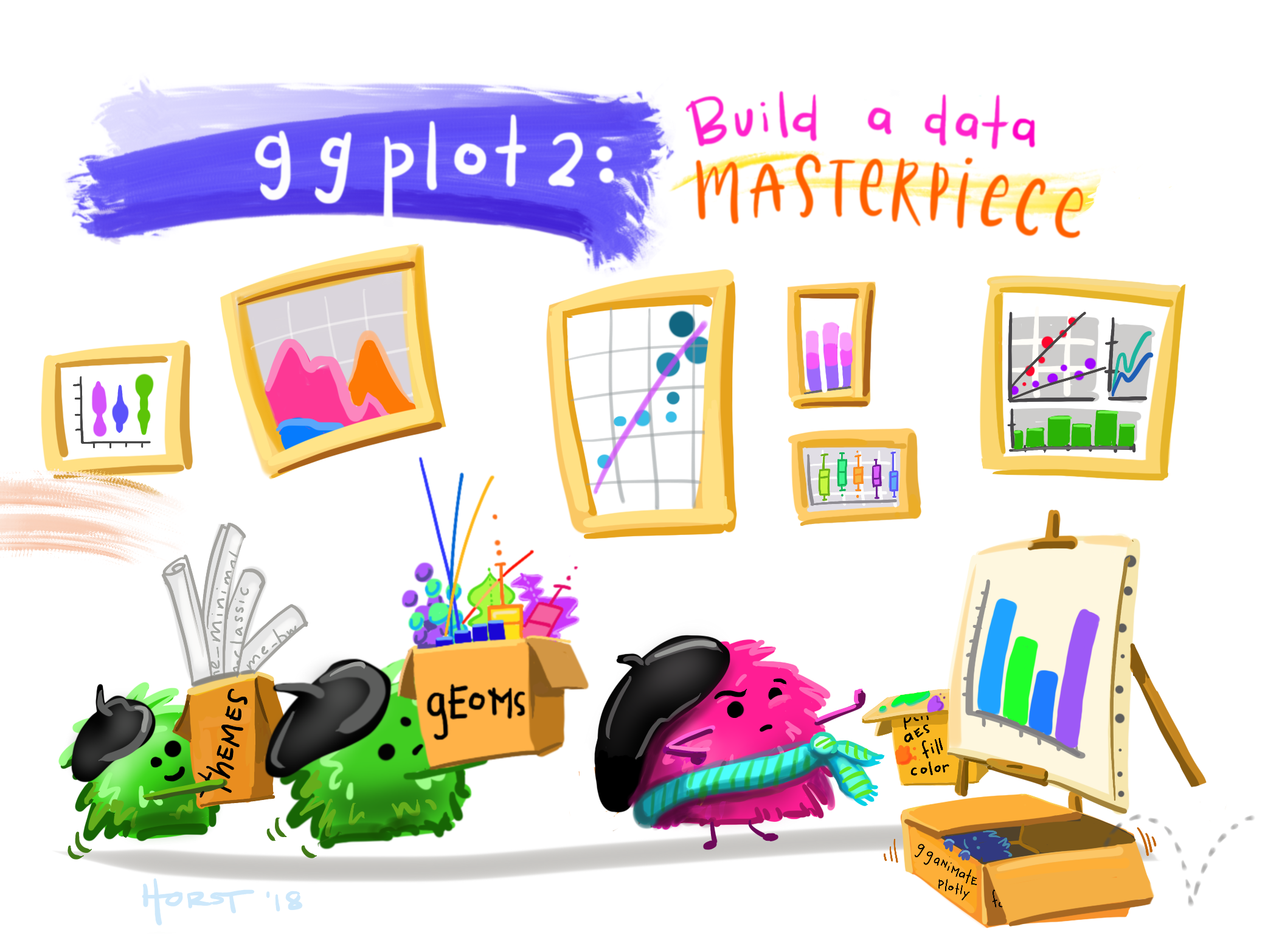
ggplot2, The Layered Grammar of Graphics
- The Essential Grammatical Elements in ggplot2
- Designing Analytical Graphics with ggplot2
ggplot Wizardry
16 Feb 2023
tidyverse is an opinionated collection of R packages designed for data science. All packages share an underlying design philosophy, grammar, and data structures.
Reference: Introduction to the Tidyverse: How to be a tidy data scientist.
An R package for declaratively creating data-driven graphics based on The Grammar of Graphics
It is part of the tidyverse family specially designed for visual exploration and communication.
For more detail, visit ggplot2 link.
Note
The transferable skills from ggplot2 are not the idiosyncrasies of plotting syntax, but a powerful way of thinking about visualisation, as a way of mapping between variables and the visual properties of geometric objects that you can perceive.
A Layered Grammar of Graphics
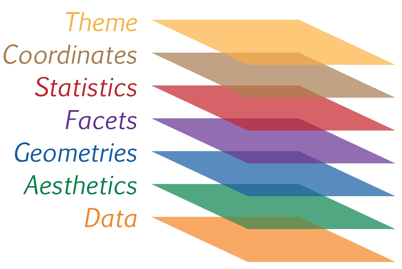
Reference: Hadley Wickham (2010) “A layered grammar of graphics.” Journal of Computational and Graphical Statistics, vol. 19, no. 1, pp. 3–28.
ggplot() function and data argumentLet us call the ggplot() function using the code chunk on the right.
Notice that a blank canvas appears.
ggplot() initializes a ggplot object.
The data argument defines the dataset to be used for plotting.
If the dataset is not already a data.frame, it will be converted to one by fortify().
aes()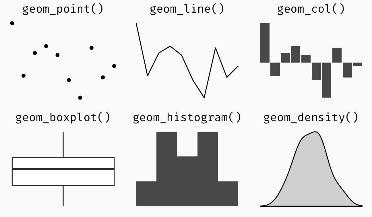
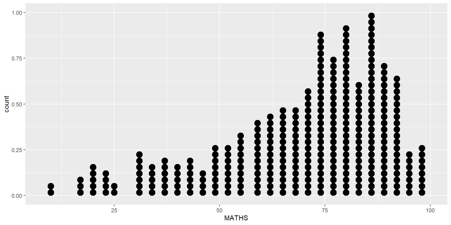
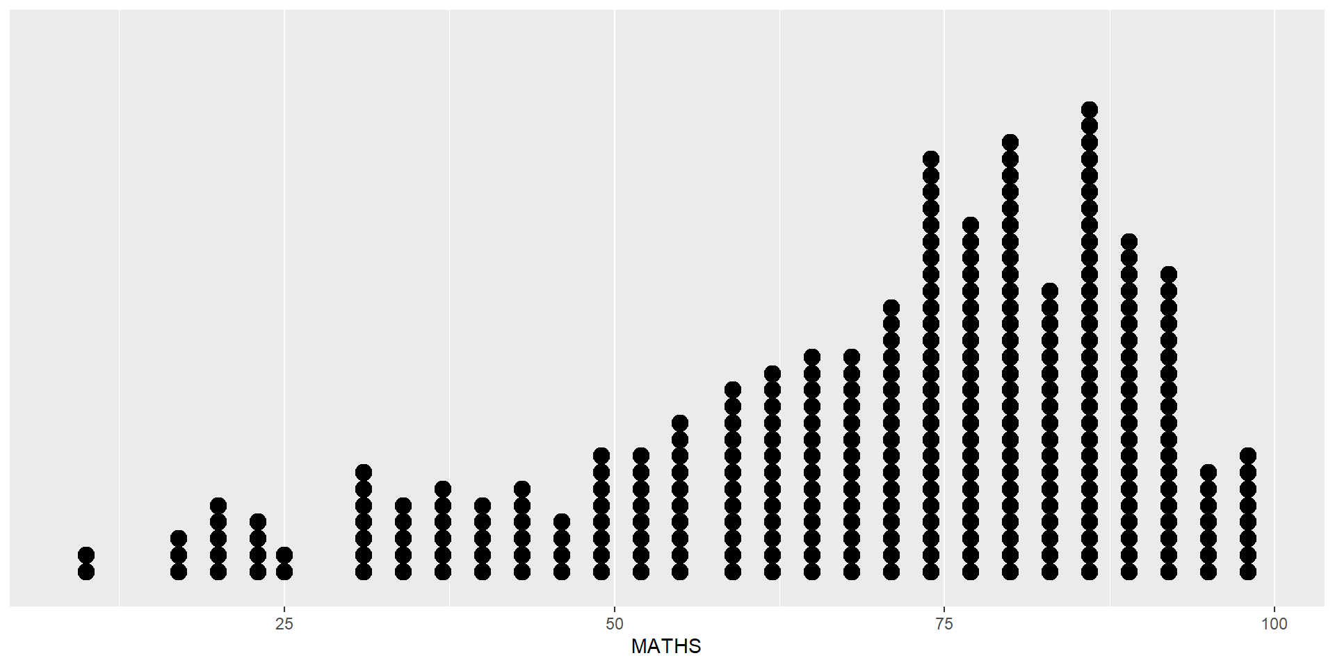
In a dot plot, the width of a dot corresponds to the bin width (or maximum width, depending on the binning algorithm), and dots are stacked, with each dot representing one observation.
Be warned
The y scale is not very useful, in fact it is very misleading.
In the code chunk below, geom_dotplot() of ggplot2 is used to plot a dot plot.
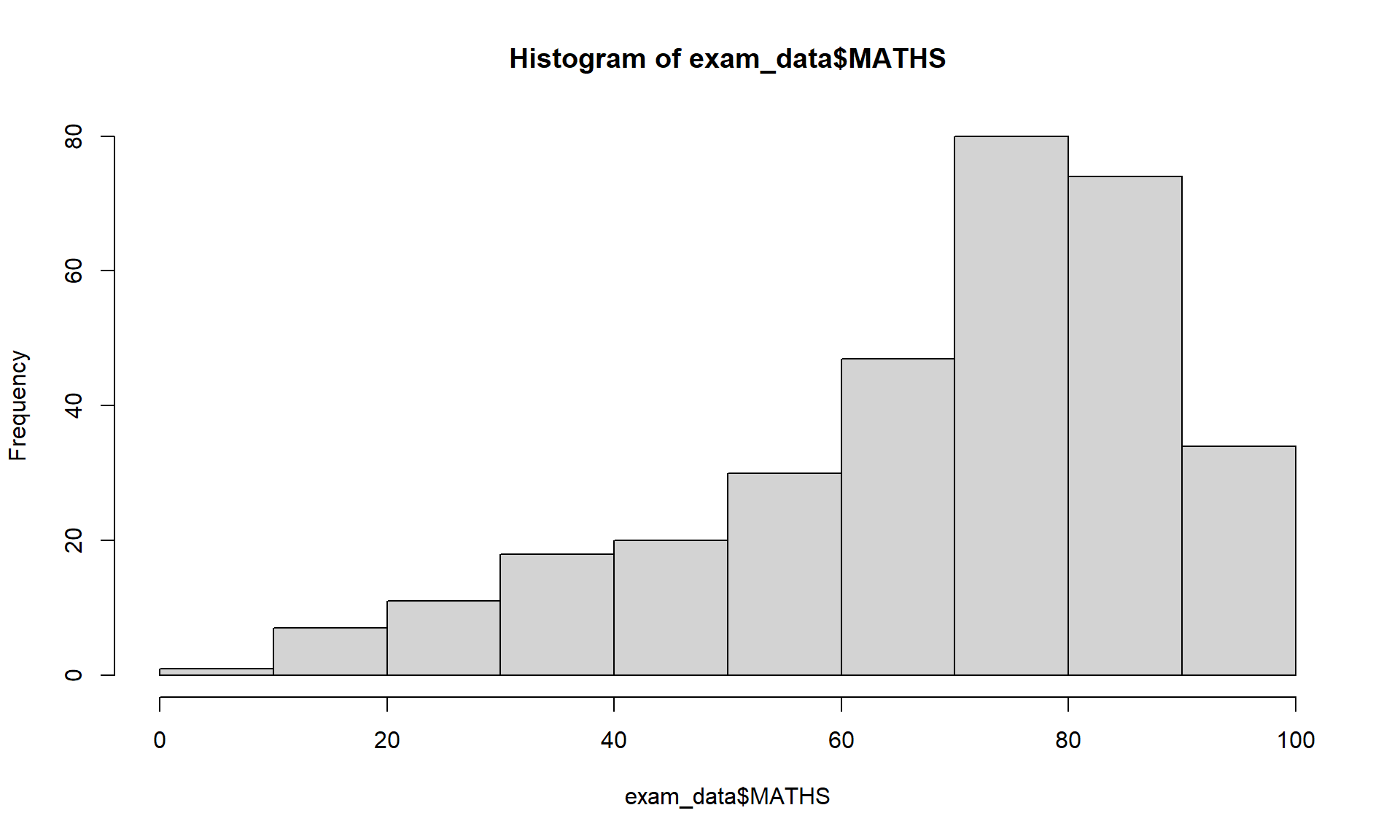
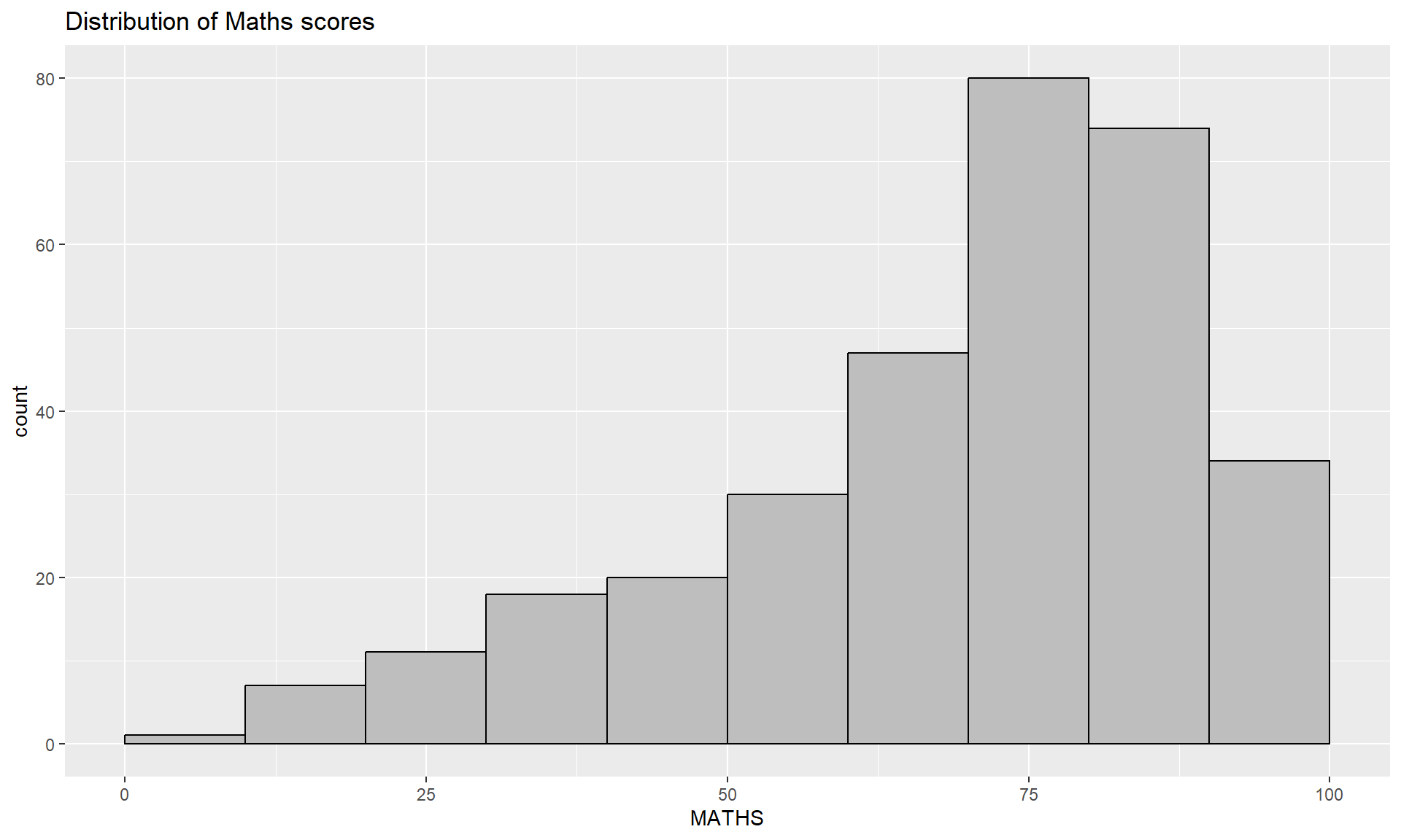
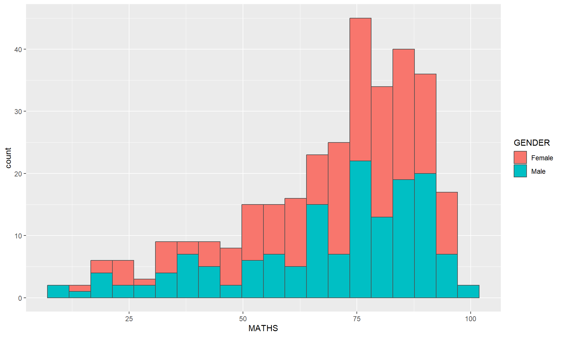
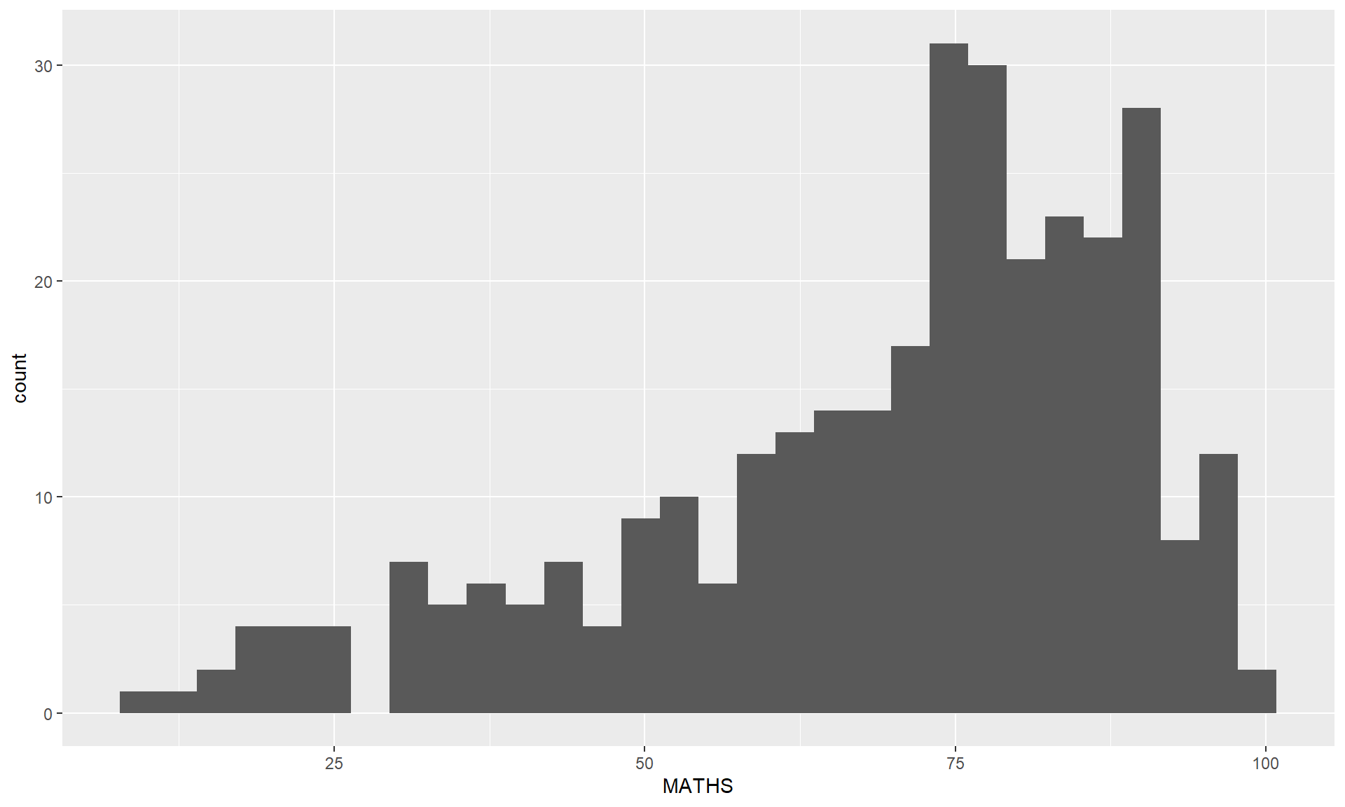
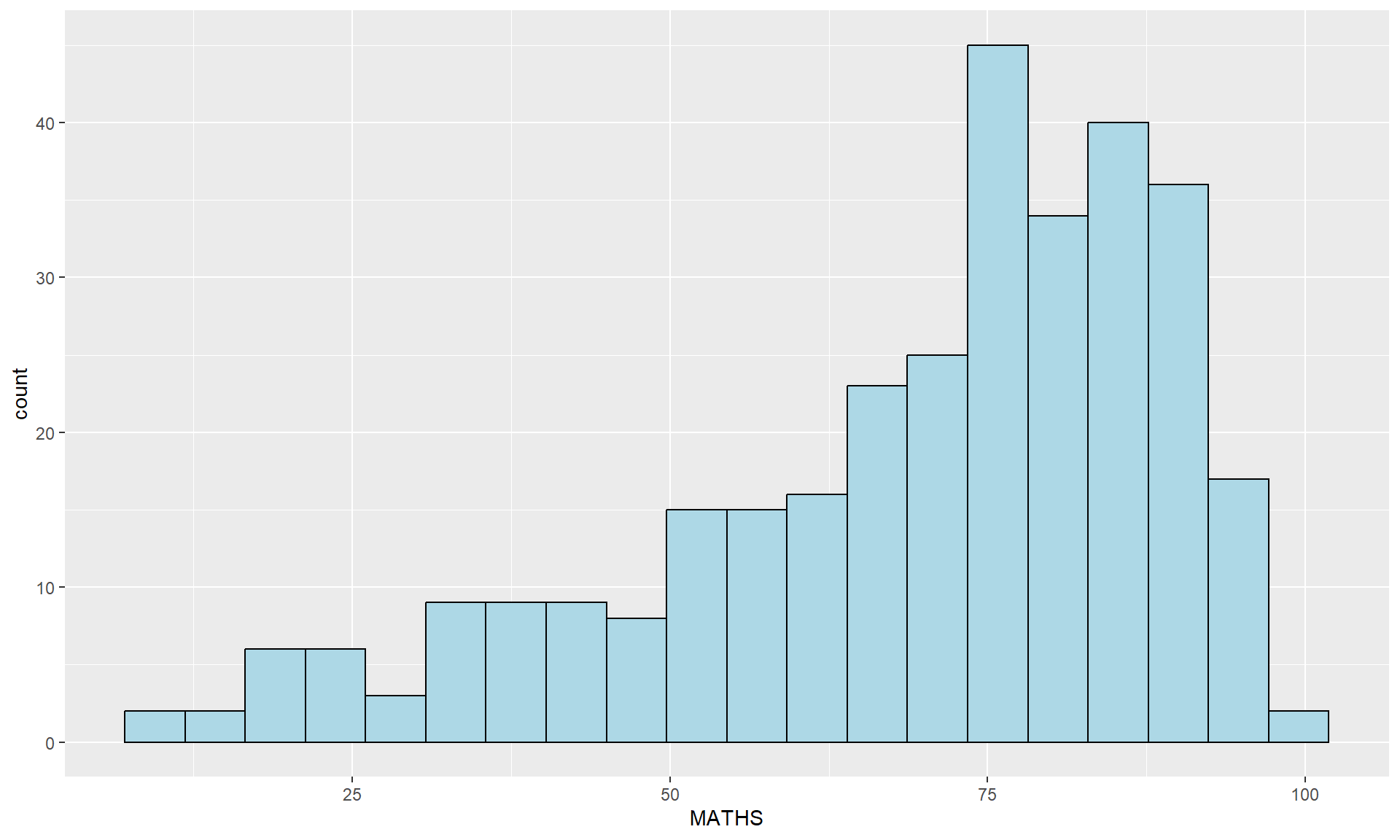
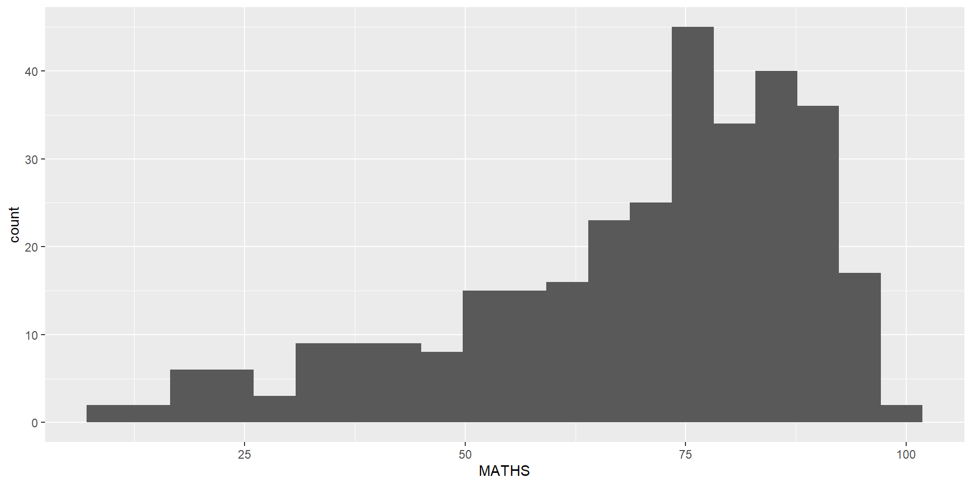
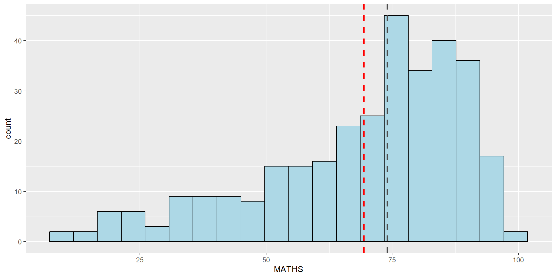
geom_histogram()In the code chunk below, geom_histogram() is used to create a simple histogram by using values in MATHS field of exam_data.
Note
Note that the default bin is 30.
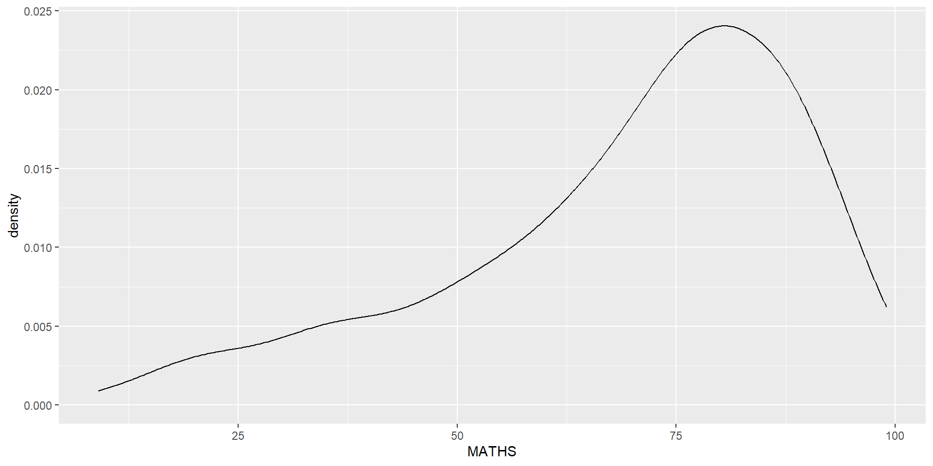
geom()In the code chunk below,
geom-density() computes and plots kernel density estimate, which is a smoothed version of the histogram.
It is a useful alternative to the histogram for continuous data that comes from an underlying smooth distribution.
The code below plots the distribution of Maths scores in a kernel density estimate plot.
Reference: Kernel density estimation
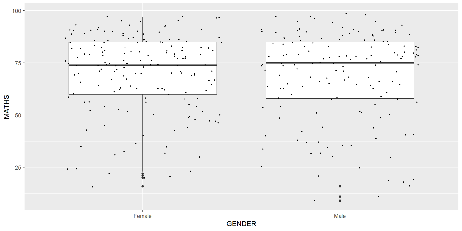
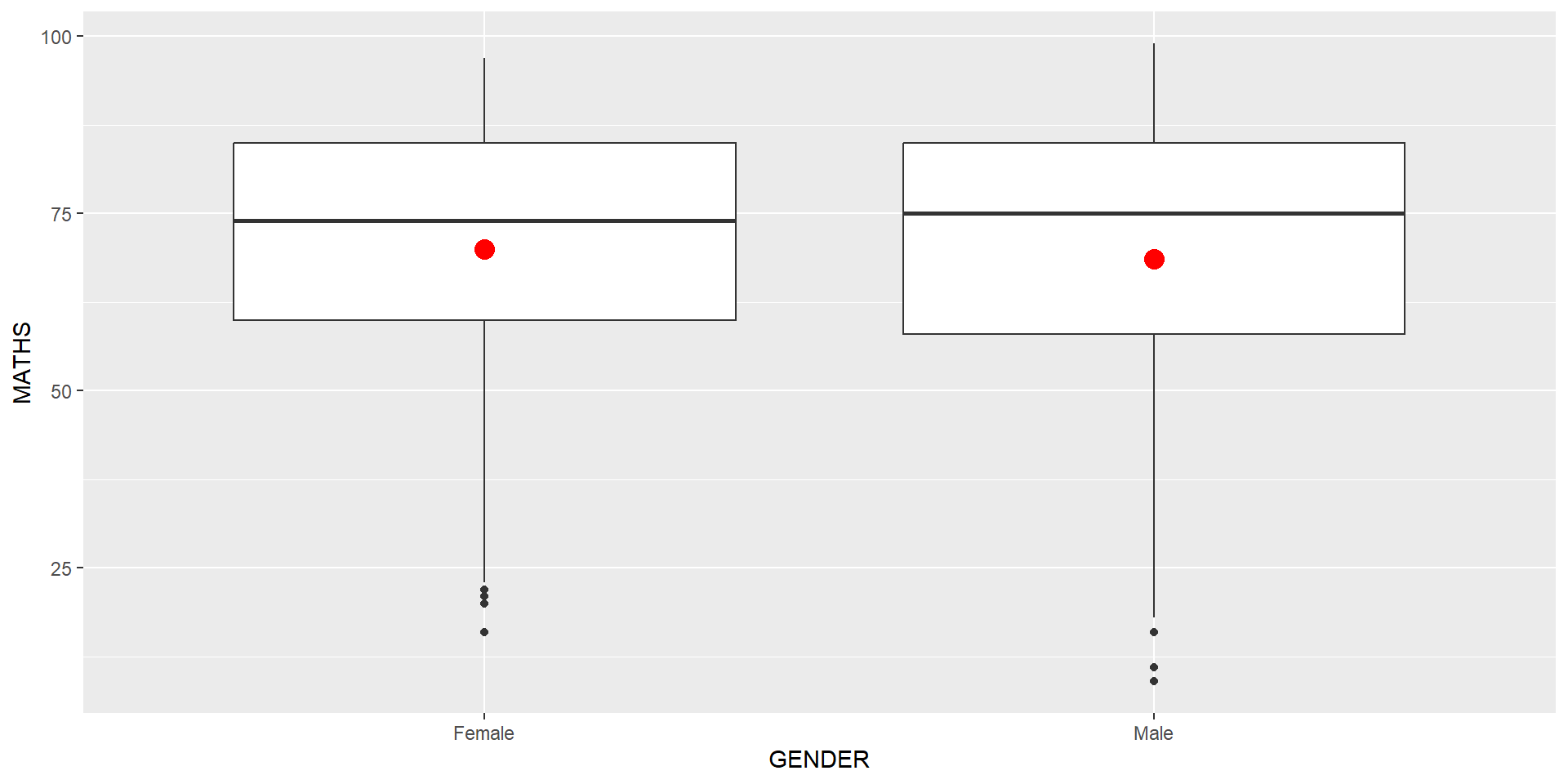
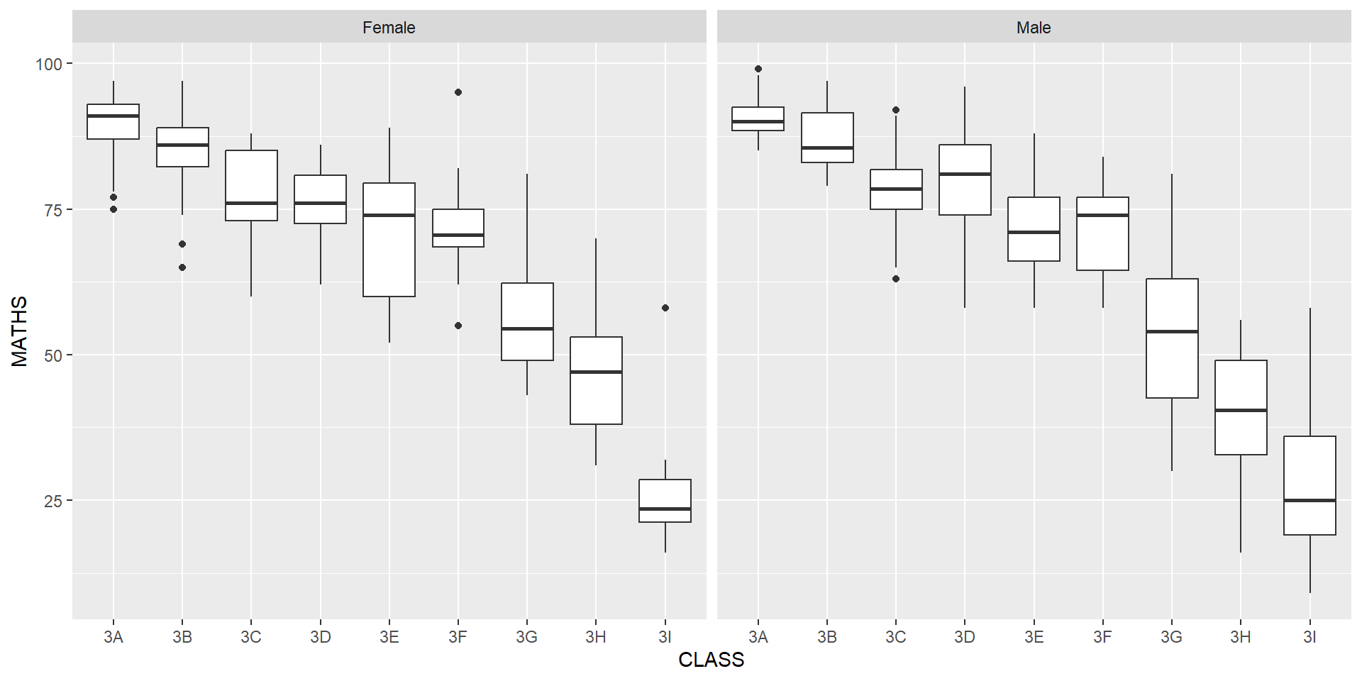
geom_boxplot() displays continuous value list. It visualises five summary statistics (the median, two hinges and two whiskers), and all “outlying” points individually.
Notches are used in box plots to help visually assess whether the medians of distributions differ. If the notches do not overlap, this is evidence that the medians are different.
The code chunk below plots the distribution of Maths scores by gender in notched plot instead of boxplot.
Reference: Notched Box Plots.

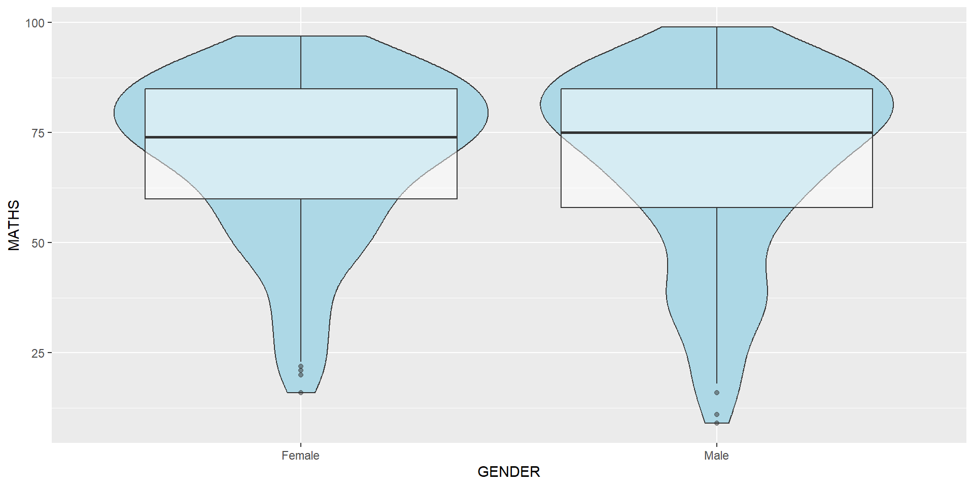
geom_violin is designed for creating violin plot. Violin plots are a way of comparing multiple data distributions. With ordinary density curves, it is difficult to compare more than just a few distributions because the lines visually interfere with each other. With a violin plot, it’s easier to compare several distributions since they’re placed side by side.
The code below plot the distribution of Maths score by gender in violin plot.
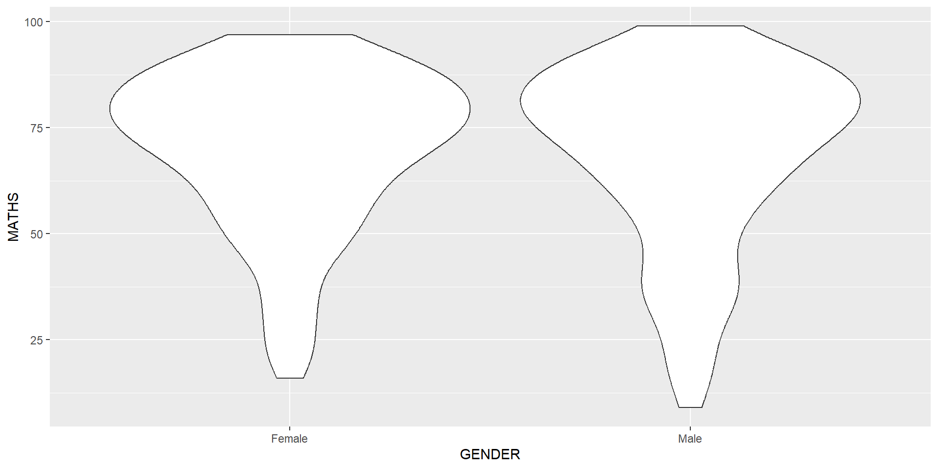
geom_violin() and geom_boxplot()geom_point()geom_point() is especially useful for creating scatterplot.geom_point().
The boxplots on the right are incomplete because the positions of the means were not shown.
Next two slides will show you how to add the mean values on the boxplots.
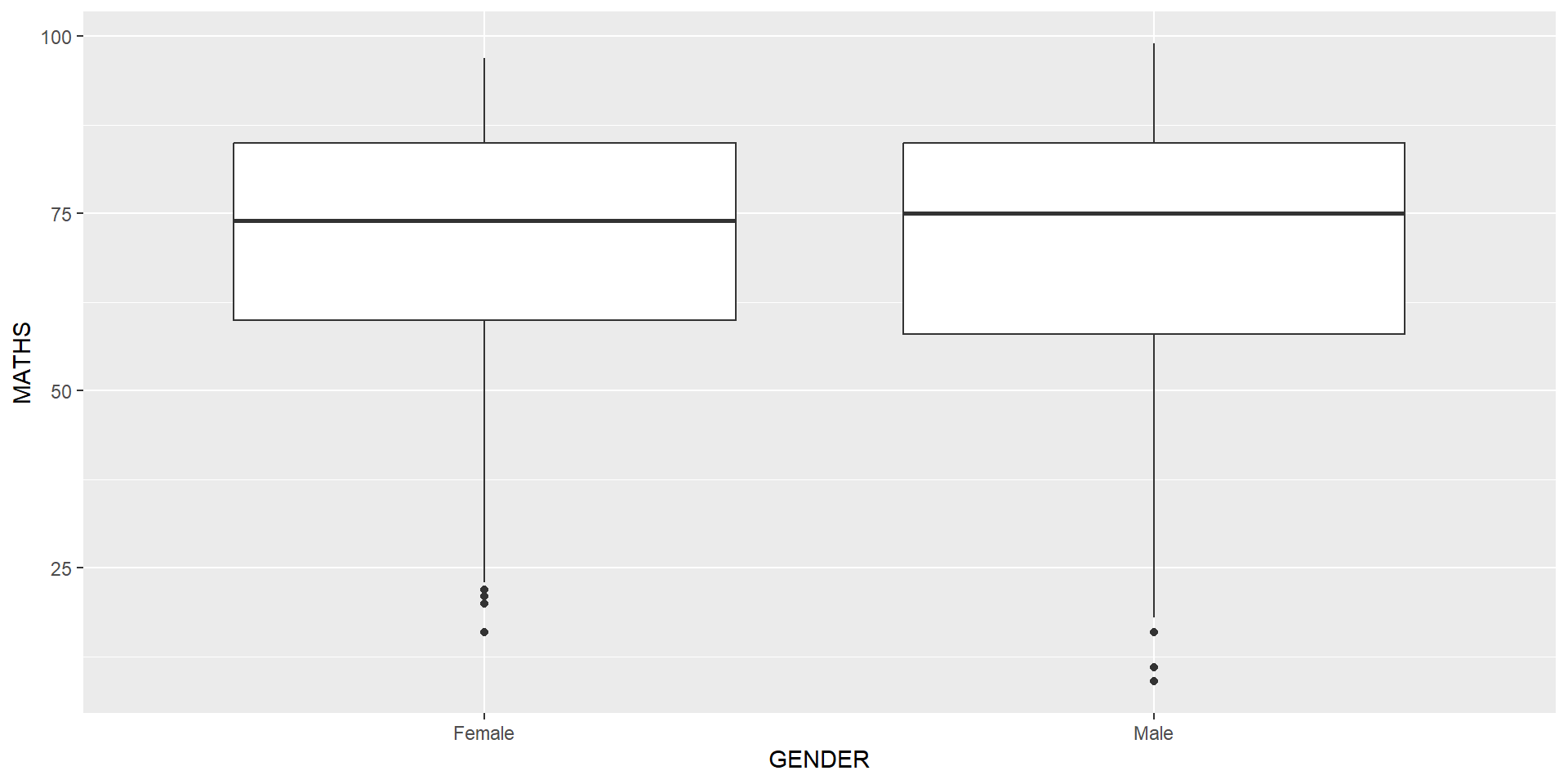
The code chunk below adds mean values by using stat_summary() function and overriding the default geom.

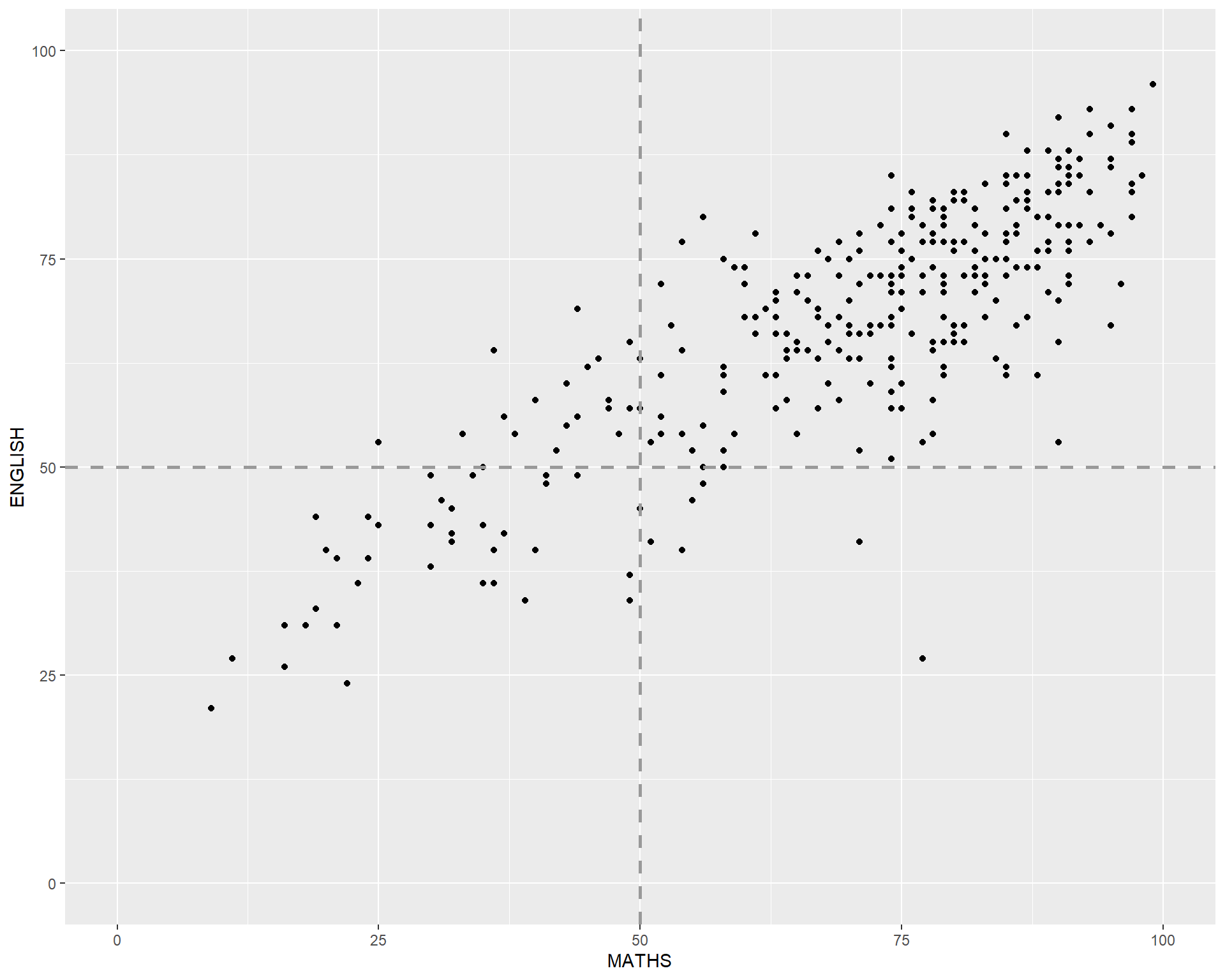
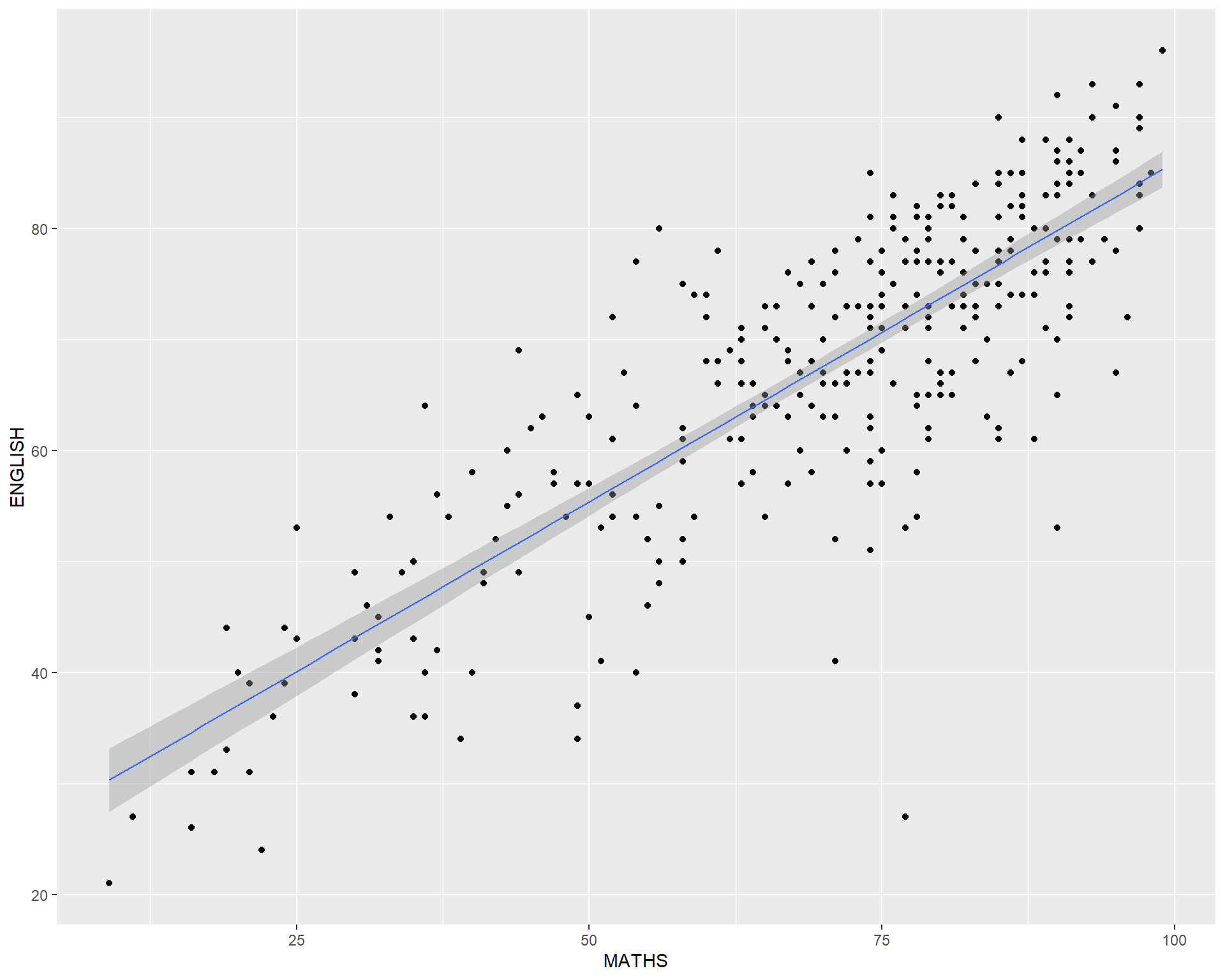
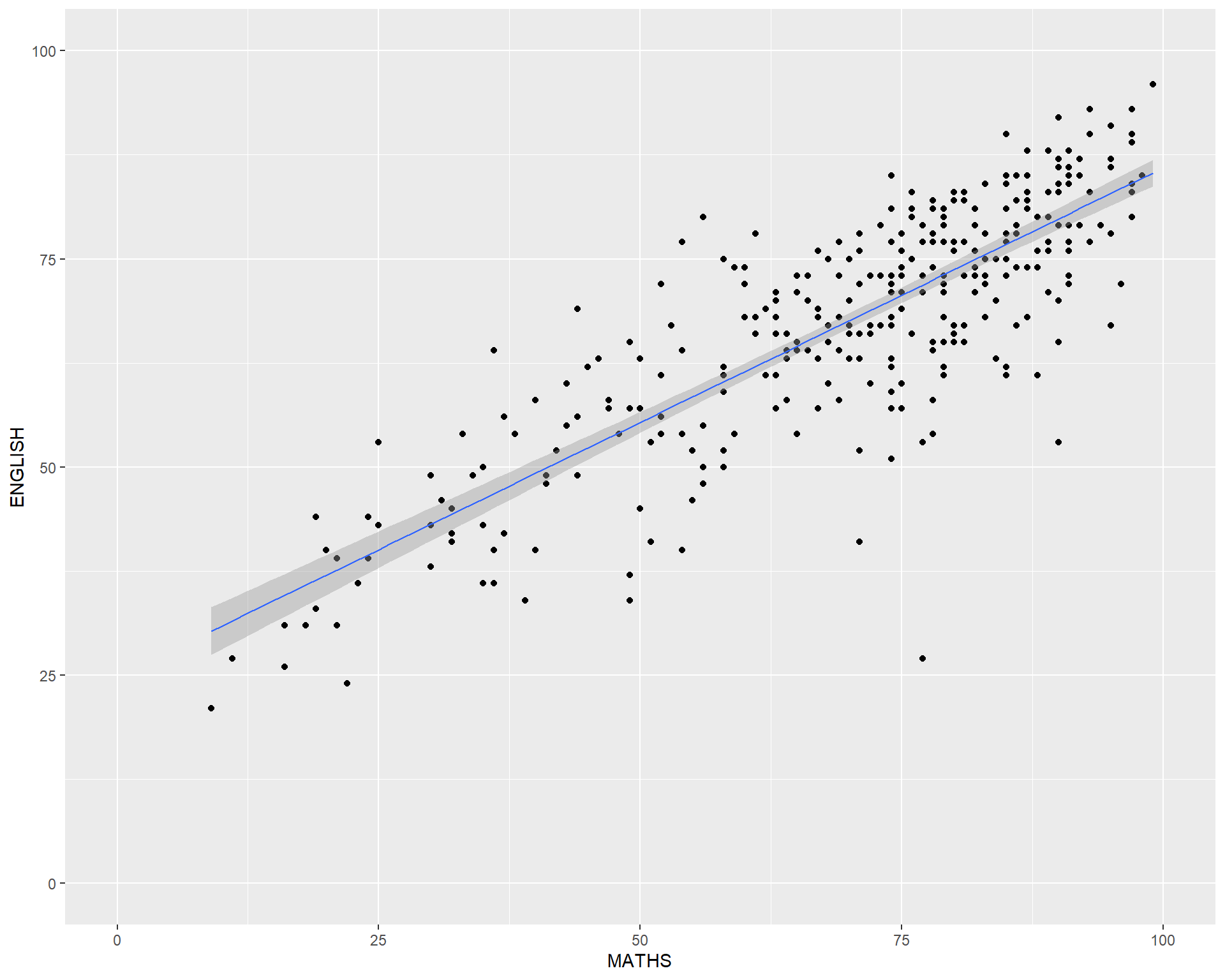
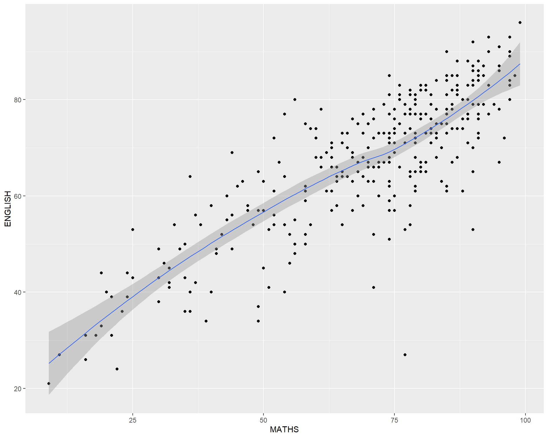
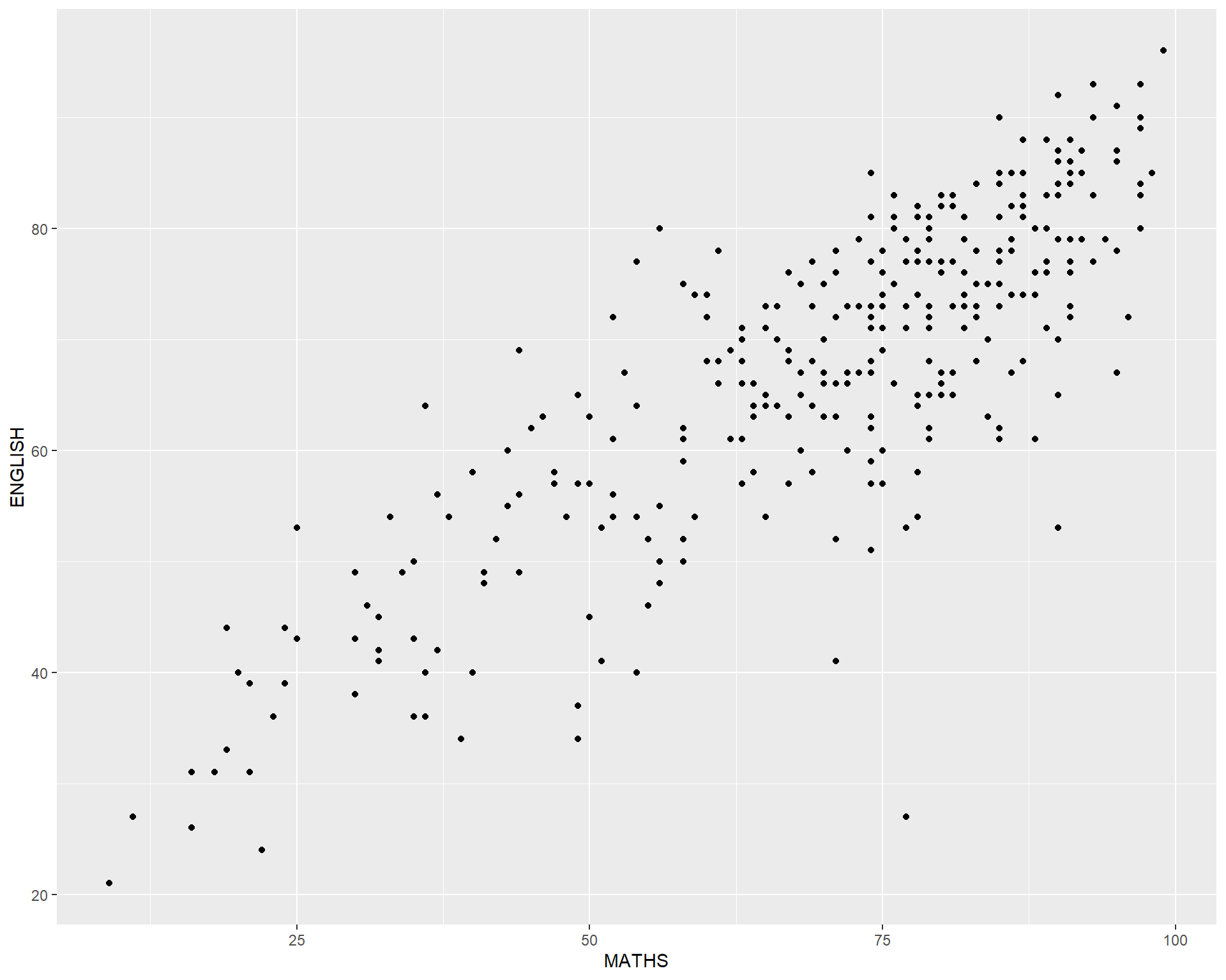
geom() methodThe scatterplot on the right shows the relationship of Maths and English grades of pupils.
The interpretability of this graph can be improved by adding a best fit curve.

In the code chunk below, geom_smooth() is used to plot a best fit curve on the scatterplot.
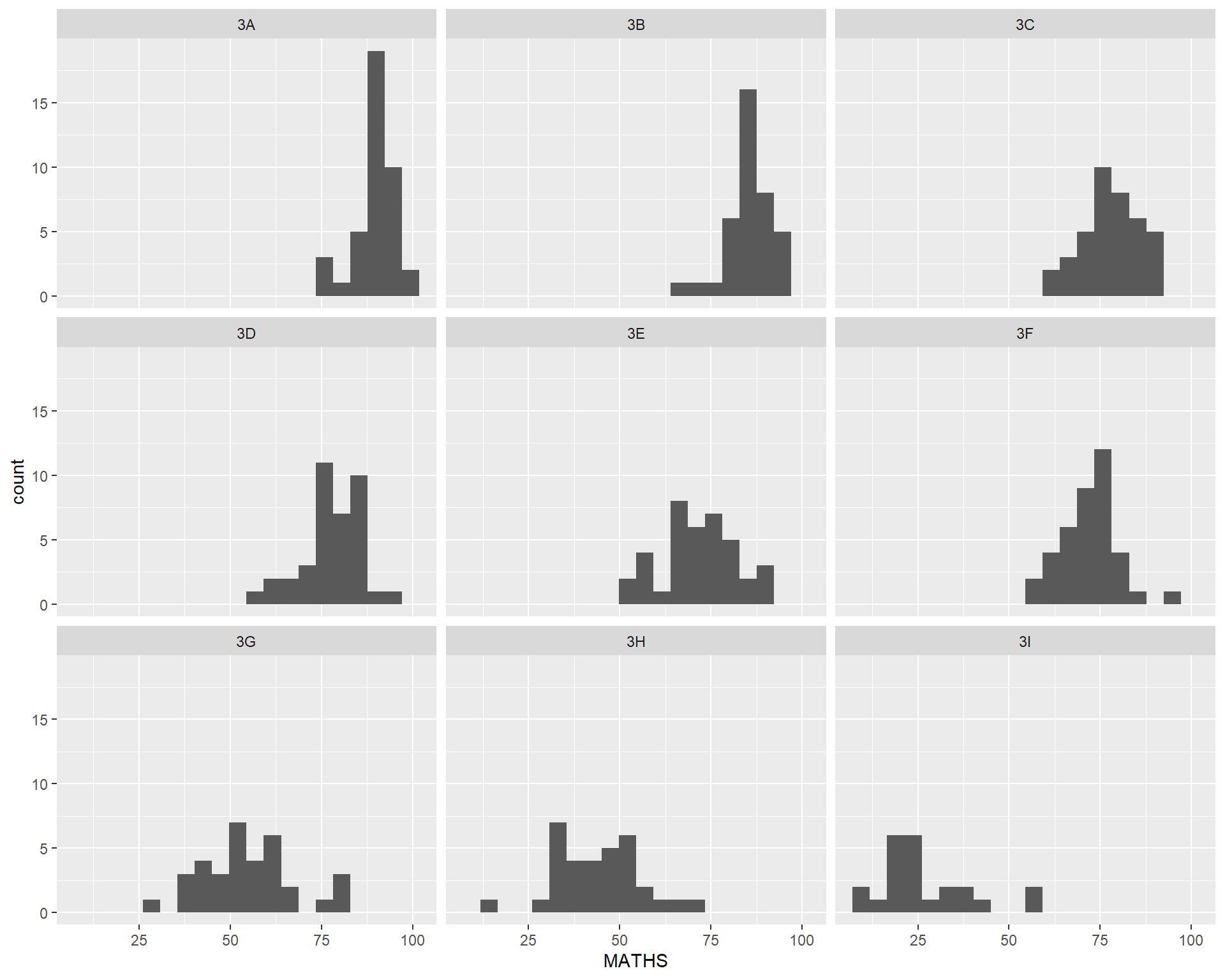
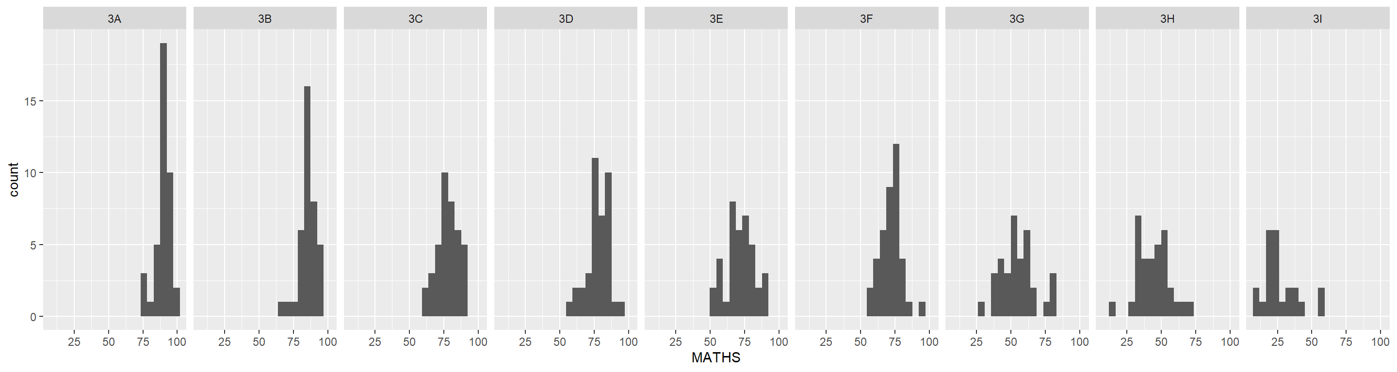
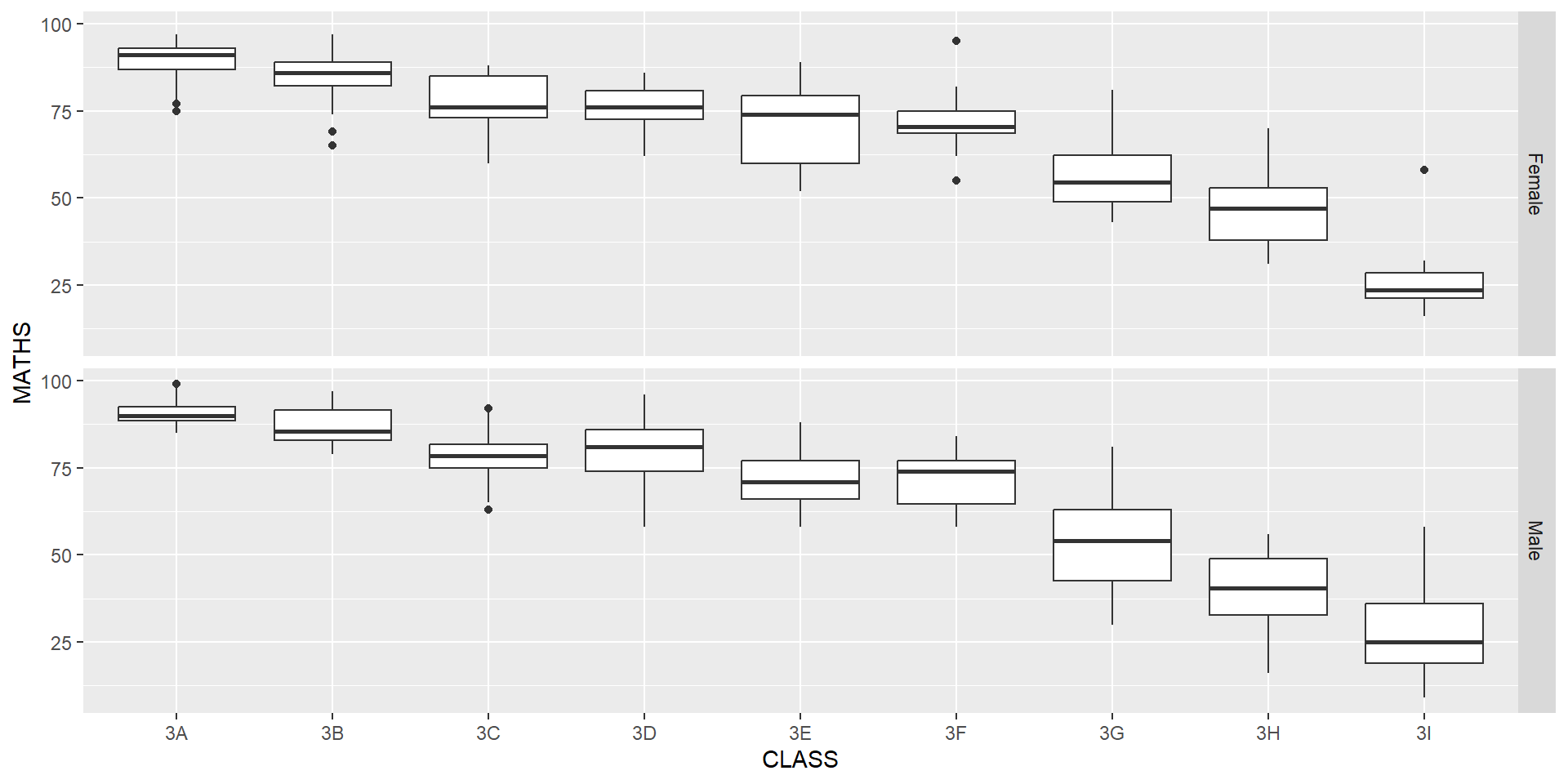
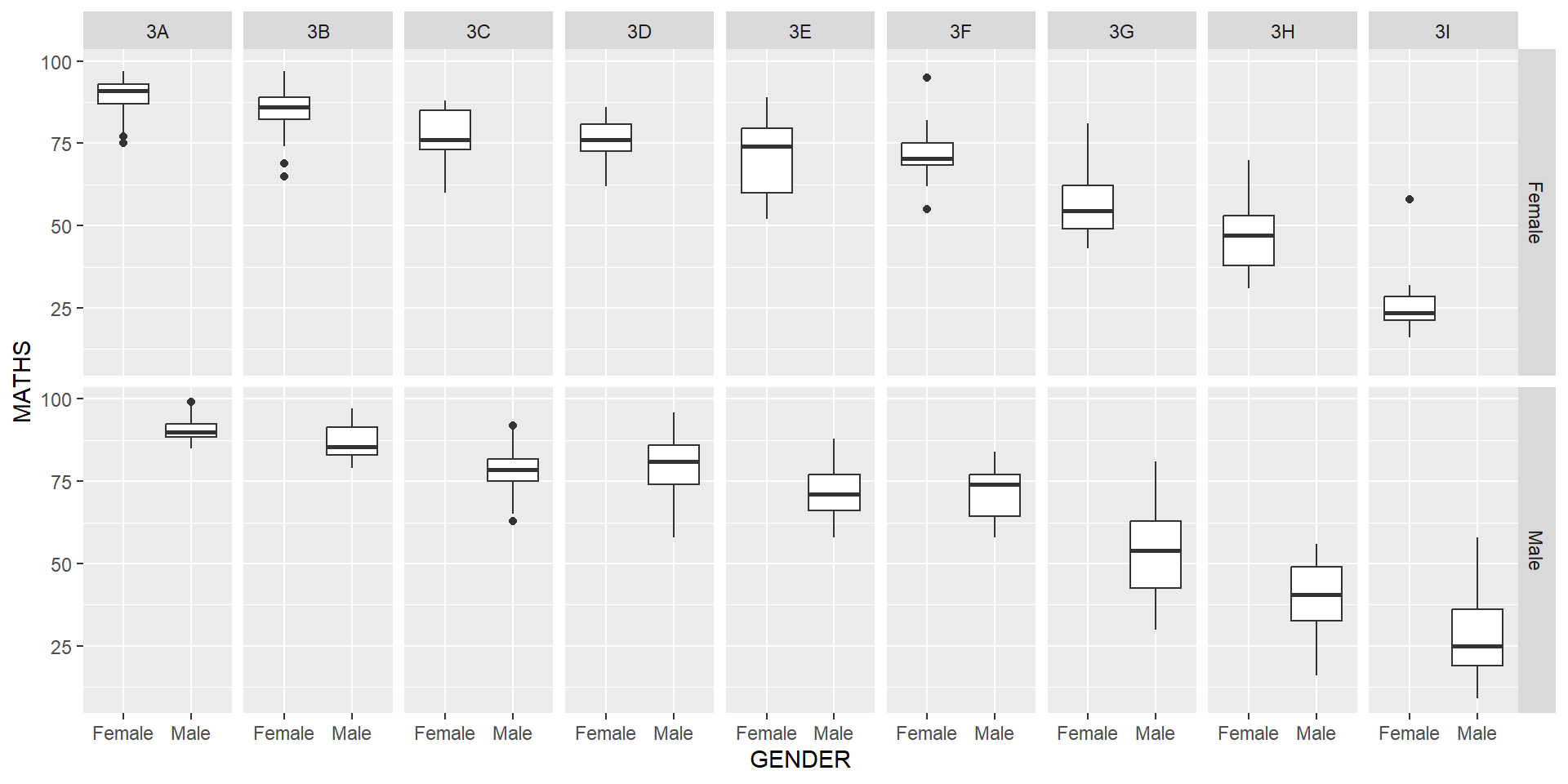
facet_wrap()facet_grid()The code chunk below plots a trellis plot using facet_grid().
The scatterplot on the right is slightly misleading because the y-aixs and x-axis range are not equal.

Your turn
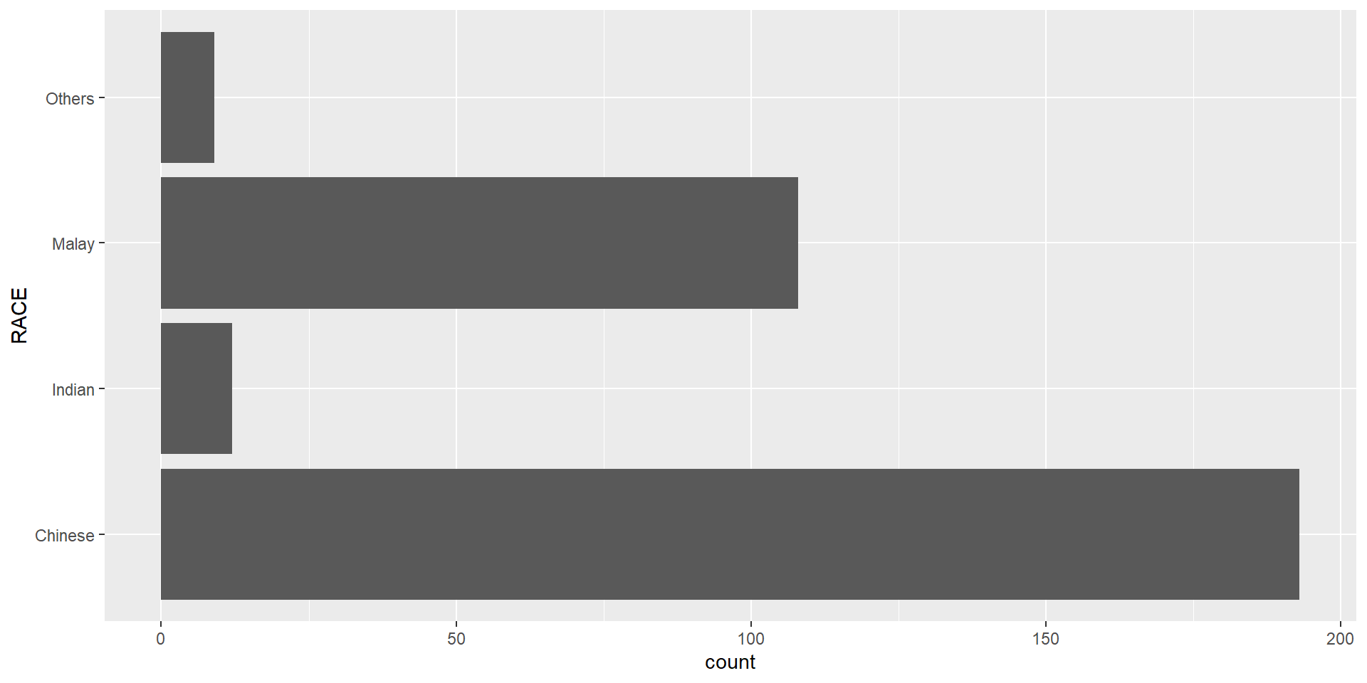
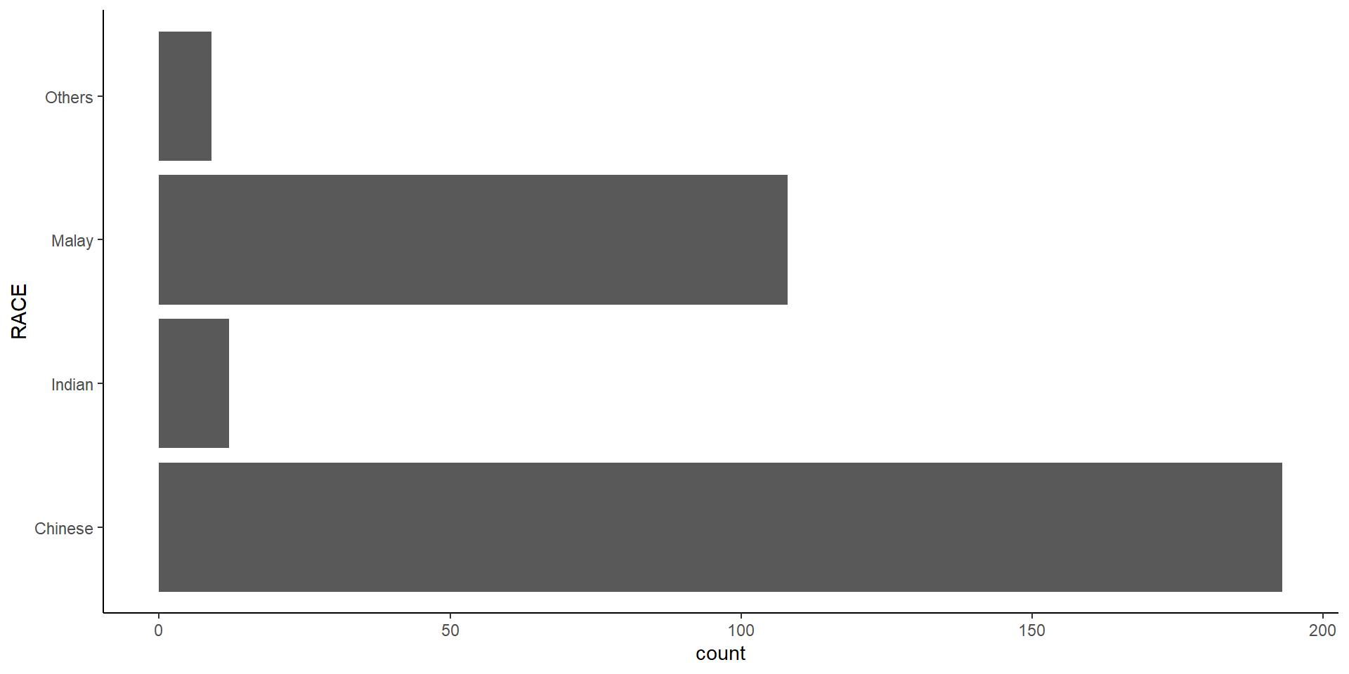
Plot a horizontal bar chart looks similar to the figure below.
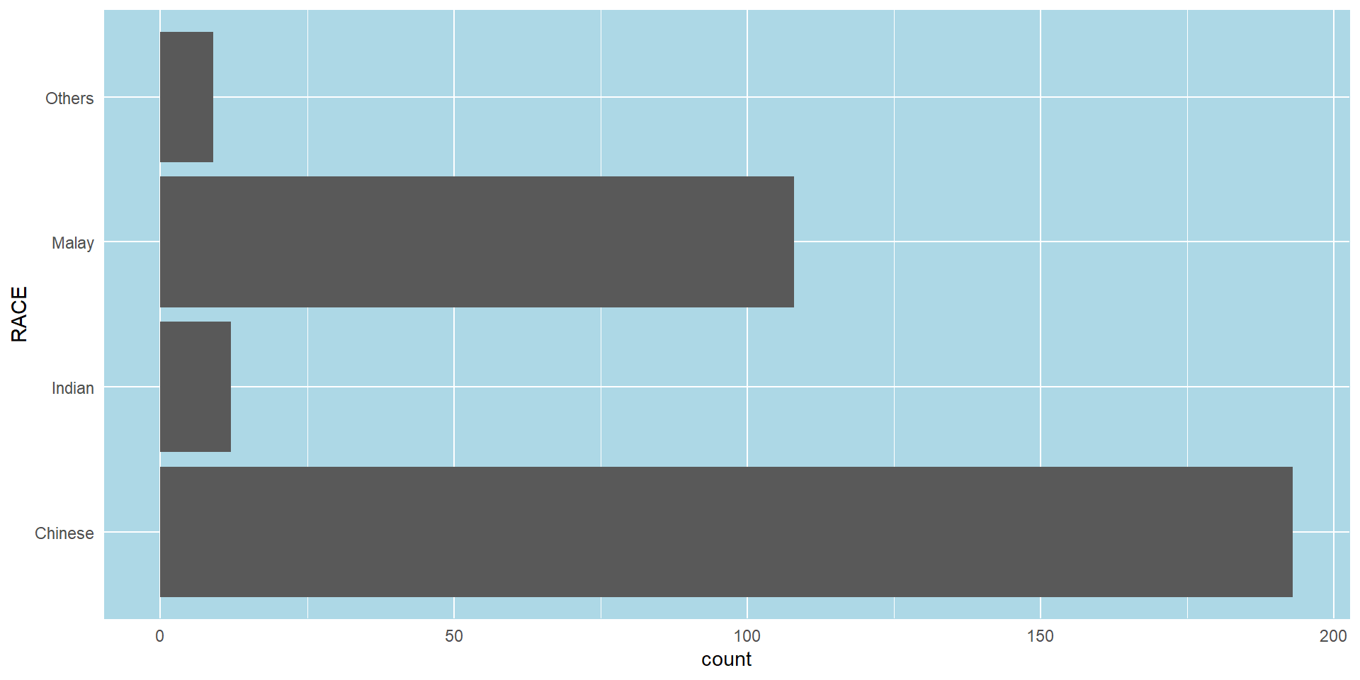
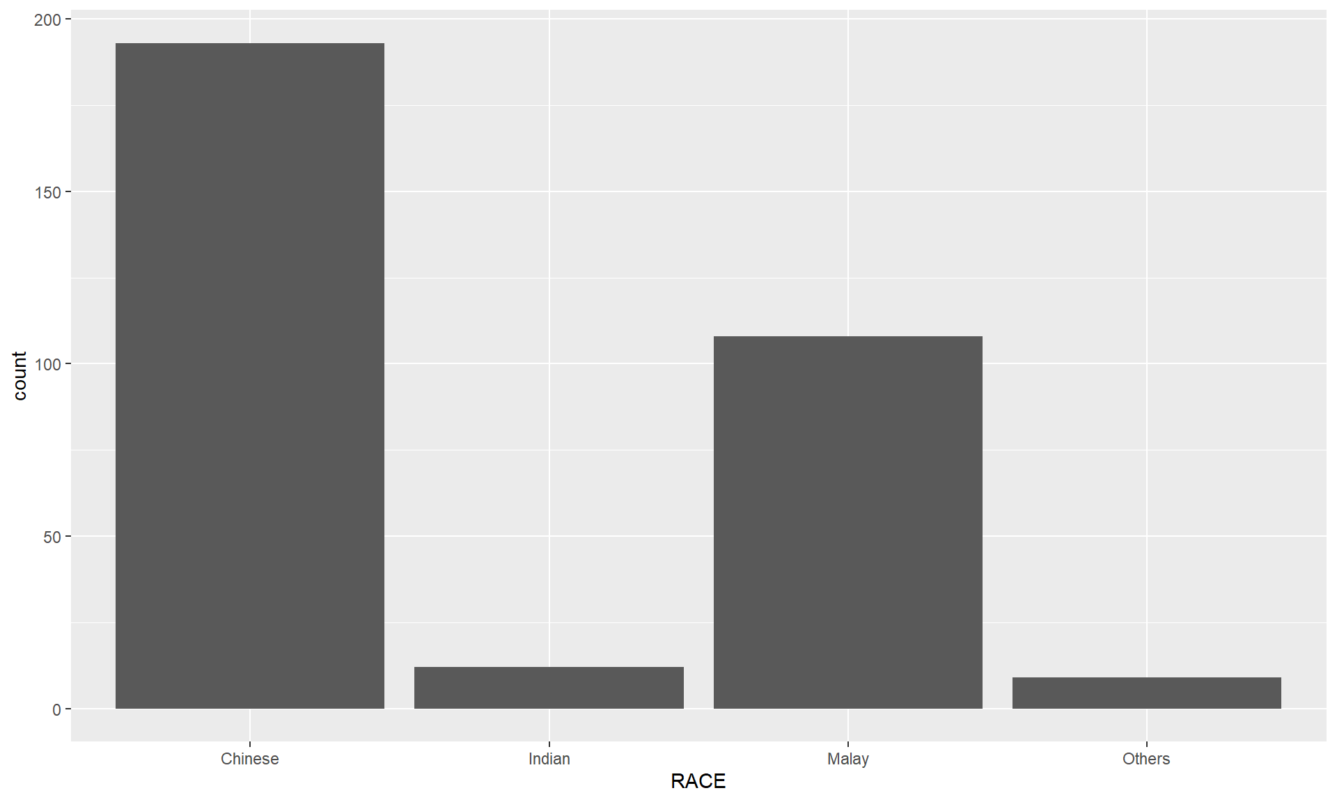
theme_minimal() to light blue and the color of grid lines to white.A simple vertical bar chart for frequency analysis. Critics:
The makeover design
With reference to the critics on the earlier slide, create a makeover looks similar to the figure on the right.
ggplot(data=exam_data,
       aes(x=reorder(RACE,RACE,
                function(x)-length(x))))+
  geom_bar() +
  ylim(0,220) +
  geom_text(stat="count",
      aes(label=paste0(..count.., ", ",
      round(..count../sum(..count..)*100,
            1), "%")),
      vjust=-1) +
  xlab("Race") +
  ylab("No. of\nPupils") +
  theme(axis.title.y=element_text(angle = 0))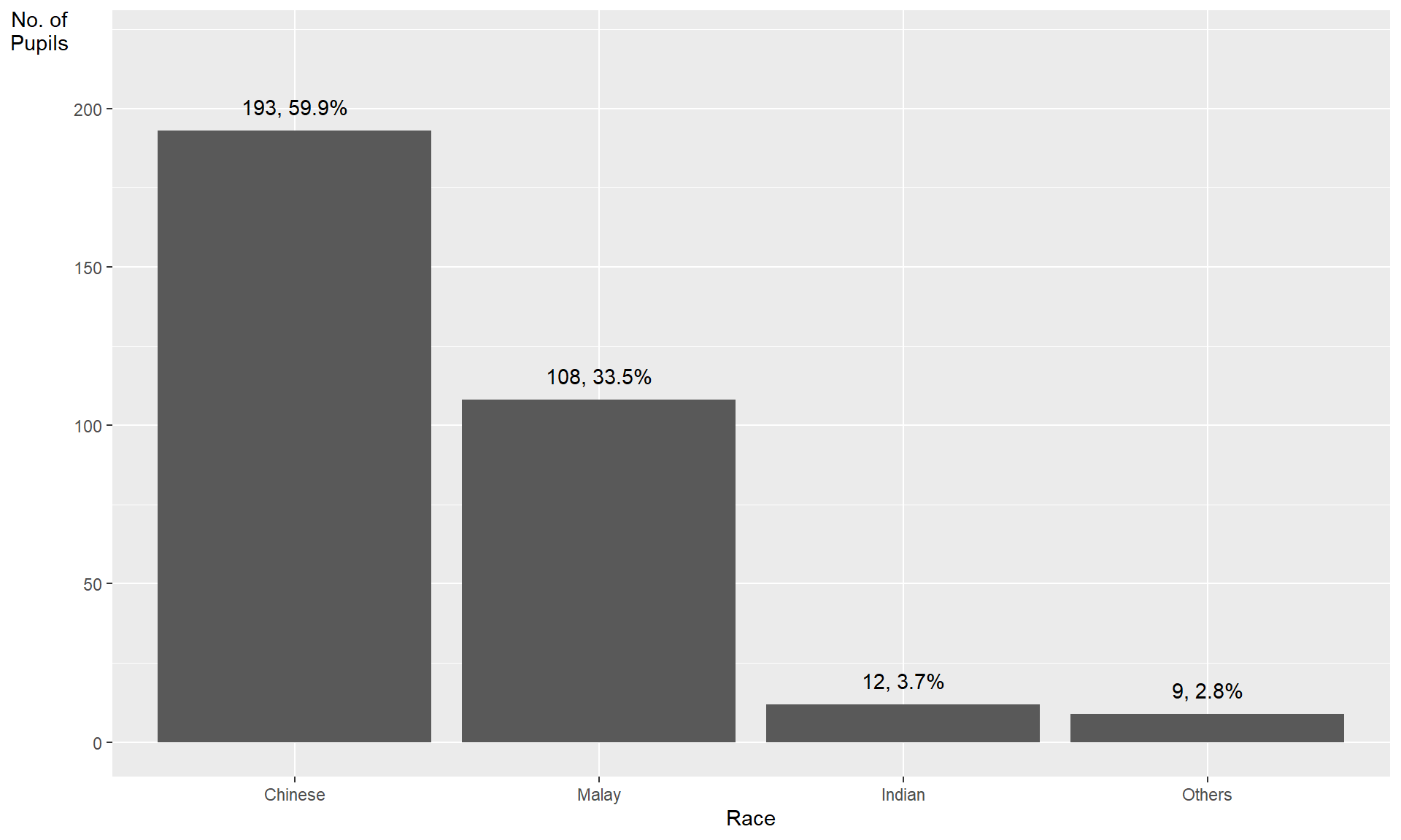
This code chunk uses fct_infreq() of forcats package.
exam_data %>%
  mutate(RACE = fct_infreq(RACE)) %>%
  ggplot(aes(x = RACE)) +
  geom_bar()+
  ylim(0,220) +
  geom_text(stat="count",
      aes(label=paste0(..count.., ", ",
      round(..count../sum(..count..)*100,
            1), "%")),
      vjust=-1) +
  xlab("Race") +
  ylab("No. of\nPupils") +
  theme(axis.title.y=element_text(angle = 0))
Credit: I learned this trick from Getting things into the right order of Prof. Claus O. Wilke, the author of Fundamentals of Data Visualization

The makeover design
The code chunk:
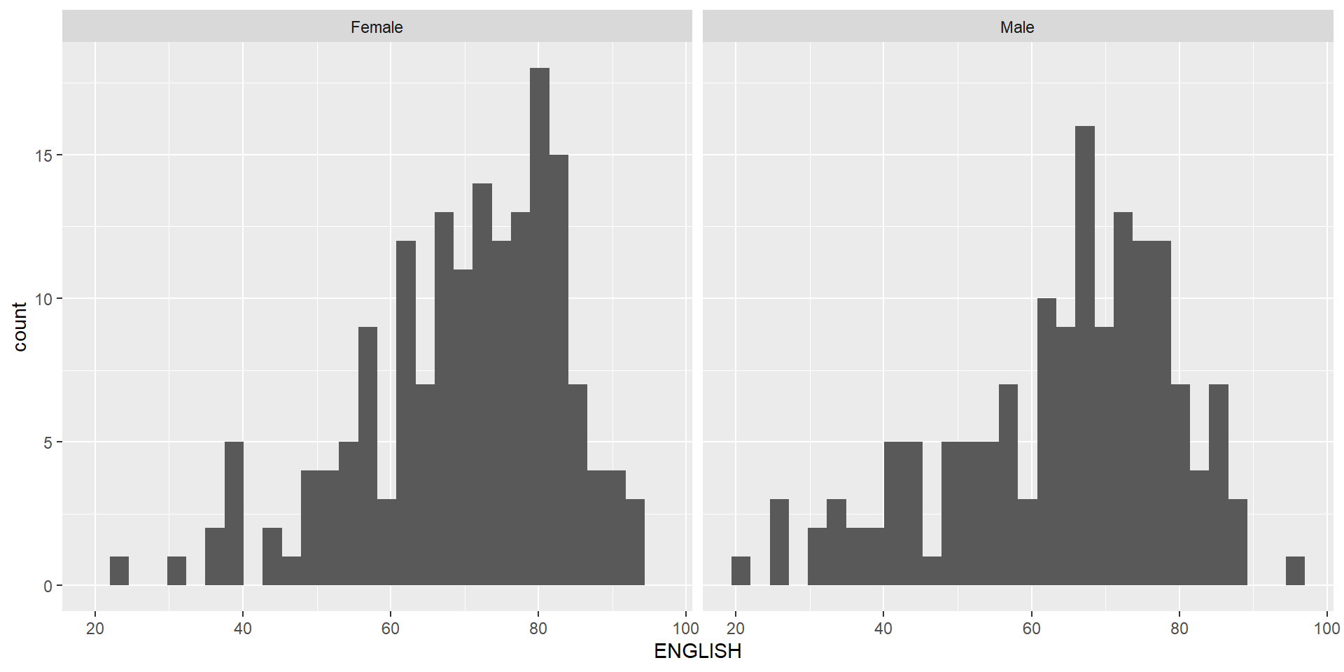
The histograms on the left are elegantly designed but not informative. This is because they only reveal the distribution of English scores by gender but without context such as all pupils.
The makeover design
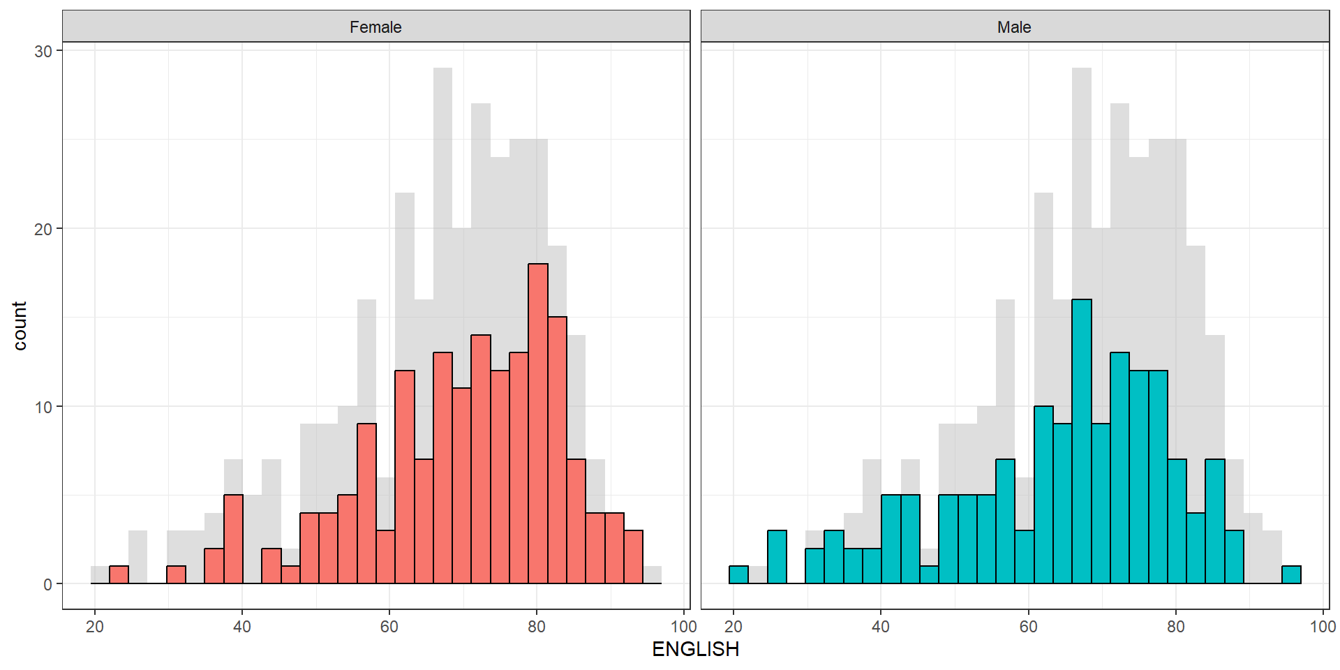
Create a makeover looks similar to the figure below. The background histograms show the distribution of English scores for all pupils.
The makeover design
Create a makeover looks similar to the figure on the right.
A within group scatterplot with reference lines.